Author: Vaibhav Gupta

  • 12+ Shadcn Select Components for Modern React Applications

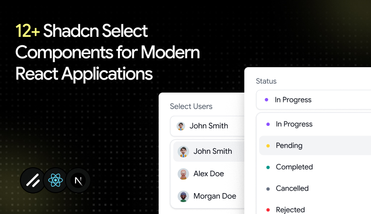
    12+ Shadcn Select Components for Modern React Applications

    Key Takeaways

    • Shadcn select is a button-triggered dropdown that ships with both Radix UI and Base UI docs, so you choose the primitive.
    • The code copies into your project, which means you own styling, state, and validation with no upstream lock-in.
    • These patterns map to real screens: required fields, status flows, time zones, multi-select, grouped lists, and validated form submits.
    • Install through the Shadcn CLI with pnpm, npm, yarn, or bun, then paste the code straight into your repo.
    • Use select for one pick from a known list. Reach for a combobox or a radio group when the list is searchable or very short.

    A broken select rarely looks broken. It looks fine until a user tabs into it and focus disappears, or the pop-up opens off-screen on a laptop, or a form submits with an empty value because validation never fired. Small bug, big trust problem.

    That is why select deserves more thought than most developers give it. You build it once, then it sits inside signup, settings, filters, and dashboards for years. If the base is weak, every screen that uses it inherits the weakness.

    This guide walks you through the best shadcn select components built for real React and Next.js apps.


    What is Shadcn Select?

    Shadcn Select is a dropdown input that shows a list of options for the user to pick from, triggered by a button. The official shadcn/ui docs describe it that way, and they ship docs for both Radix UI and Base UI primitives.

    The difference from older libraries is ownership. The component code lands inside your repo, so you read it, style it, and debug it without fighting a black box.

    Accessibility behaviors, such as keyboard navigation and focus handling, come from the underlying Radix UI or Base UI primitives. You start on solid ground, then shape the rest with Tailwind CSS.


    Why Select is one of the most used UI patterns

    A select does one job well: it lets a user pick one value from many without flooding the screen. That single job shows up almost everywhere you build.

    Signup forms need a role or country. Dashboards need status and date filters. Settings panels need a timezone and a language. Each of these is a select waiting to happen.

    It also keeps the layout tight. Ten radio buttons eat vertical space, while one trigger and a clean pop-up stay compact. And because the chosen value reads as a simple string or array, it slots into form libraries and validation without extra glue code.

    That mix of small footprint and strong form fit is why a React select component shows up in nearly every product I touch.


    How these Select components were evaluated

    Each select component was evaluated on more than just design. The following criteria were used to ensure they meet the demands of real-world applications:

    CriteriaDescription
    AccessibilityEvaluated keyboard navigation, focus management, and screen reader support using accessible headless primitives like Radix UI or Base UI.
    Code ClarityReviewed code structure, readability, and maintainability to assess ease of customization and extension.
    Install FlowMeasured how quickly and easily the component can be integrated into a project, including CLI-based setup.
    State HandlingAssessed management of selected values, open/closed states, and placeholders for predictable behavior.
    Form IntegrationTested compatibility with HTML forms and libraries like React Hook Form and Zod, including validation and error handling.
    Use Case VersatilityEvaluated flexibility across common scenarios such as dashboards, settings panels, and onboarding flows.

    Install Once, Copy-Paste Everywhere

    Every pattern here installs through the Shadcn CLI. You can use pnpm, npm, yarn, or bun, so it fits whatever your team already runs. The flow is a direct copy-paste approach, which means the source code lands in your project and you own every line.

    Here is one sample install command for pnpm:

    pnpm dlx shadcn@latest add @shadcn-space/select-01

    Swap the package manager prefix for your setup, and the rest stays the same. The patterns support both Radix UI and Base UI, and they were built with React, Next.js, Tailwind CSS, and Framer Motion.


    Best Shadcn Select components and examples

    Explore a curated collection of Shadcn select components, patterns, and real-world examples.

    Required Select
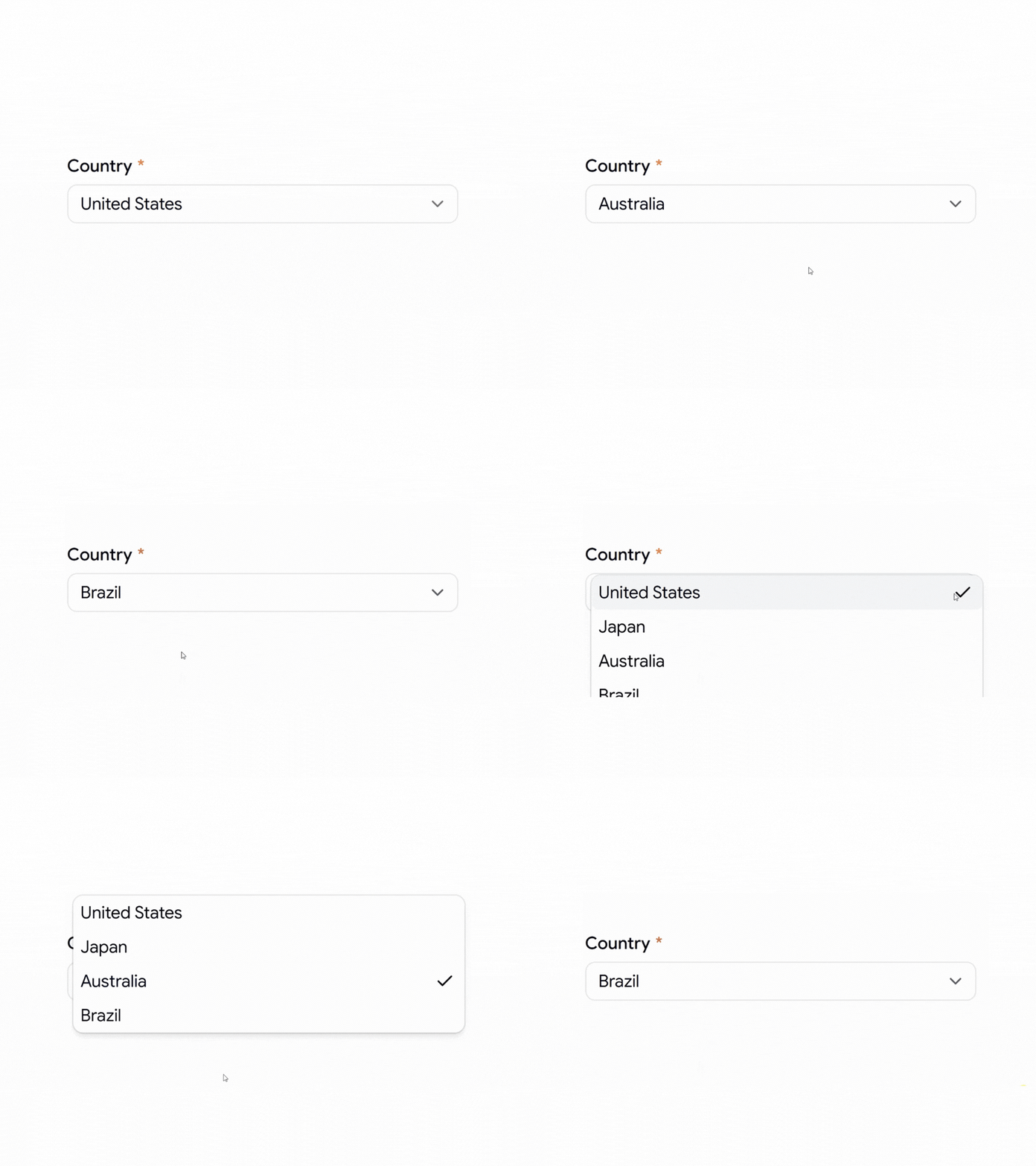
    Required Select

    This is the field a user cannot skip, so it displays a required indicator and ties into validation to prevent an empty submission. You own the placeholder and the error state, since the logic sits in your code rather than an external wrapper. Keyboard users move through one trigger into a clean list, with focus returning to the trigger on close.

    Use cases:

    • Signup forms that need a mandatory country
    • Checkout flows requiring a shipping region
    • Account setup with a required role
    • Survey steps that block empty answers
    • Booking forms need a chosen service type

    Best for: Forms where one field must not be left blank.

    Select with Icon
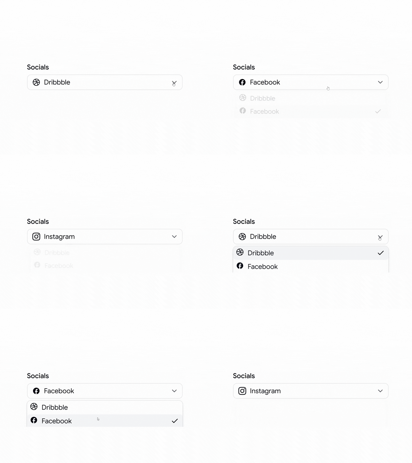
    Select with icon

    This pattern places a leading icon beside each option, which cuts the time a user spends telling similar labels apart. Icons help most when the text alone is ambiguous, like social platforms or file types. You manage the icon set, so the trigger shows the selected icon and label together, and the state stays obvious at a glance.

    Use cases:

    • Social account pickers with brand marks
    • File type selectors in upload tools
    • Payment method choices with card logos
    • Category filters that need a visual tag
    • Integration pickers in developer dashboards

    Best for: Choices where a visual cue reads faster than text.

    Select with Status
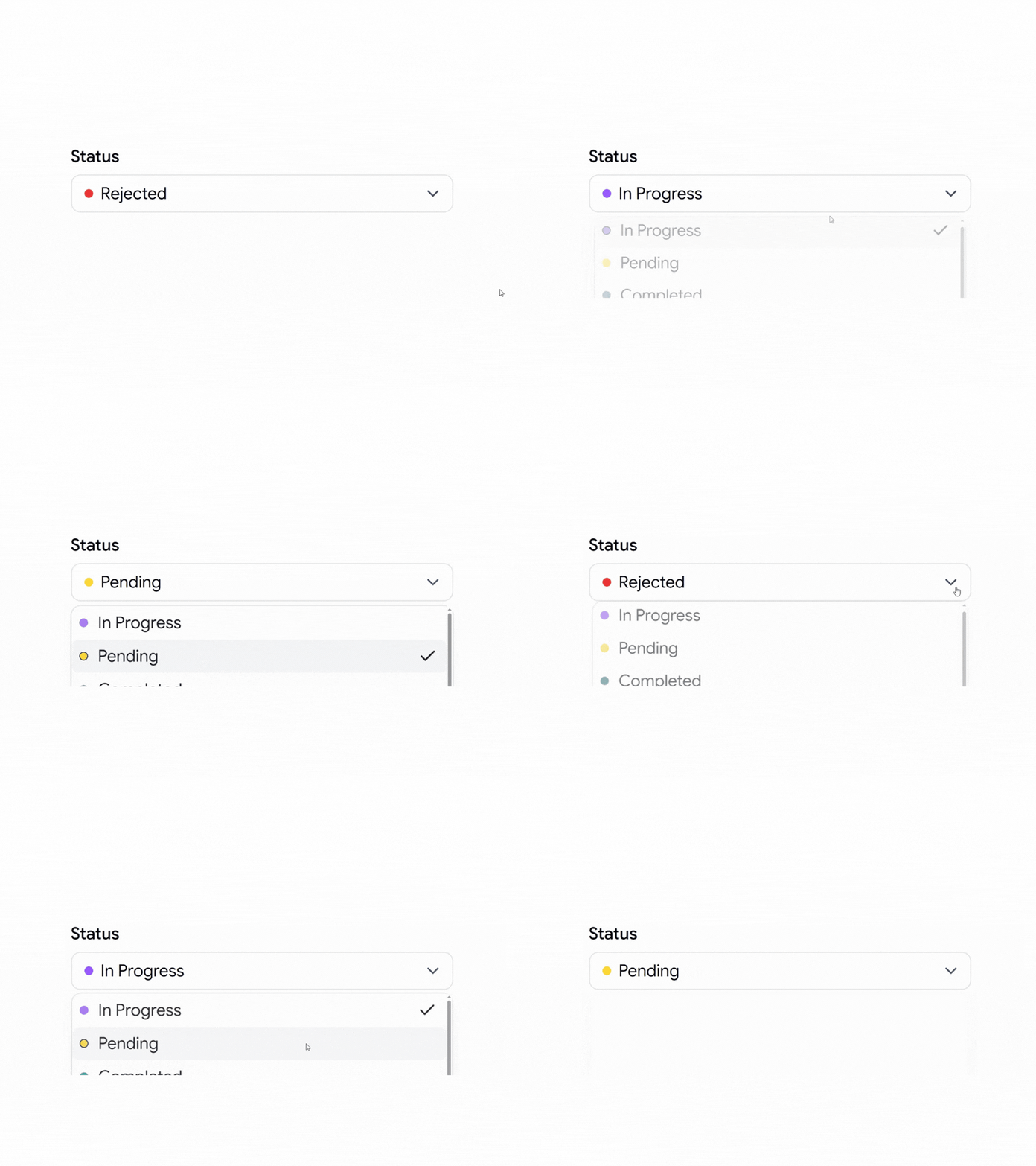
    Select with status

    This pattern shows a workflow state, like “In Progress,” with a dot or color so the current value reads at a glance. It fits task boards and tickets where status drives the rest of the flow. Because the set of states is fixed, validation stays simple, and you can wire the selected value straight into your data layer.

    Use cases:

    • Task boards with 3 to 5 workflow states
    • Ticket systems track open and closed
    • Order pipelines from pending to shipped
    • Content tools with draft and published
    • CRM deals are moving across deal stages

    Best for: Tools that track and change item state.

    Form Select with Submit Button
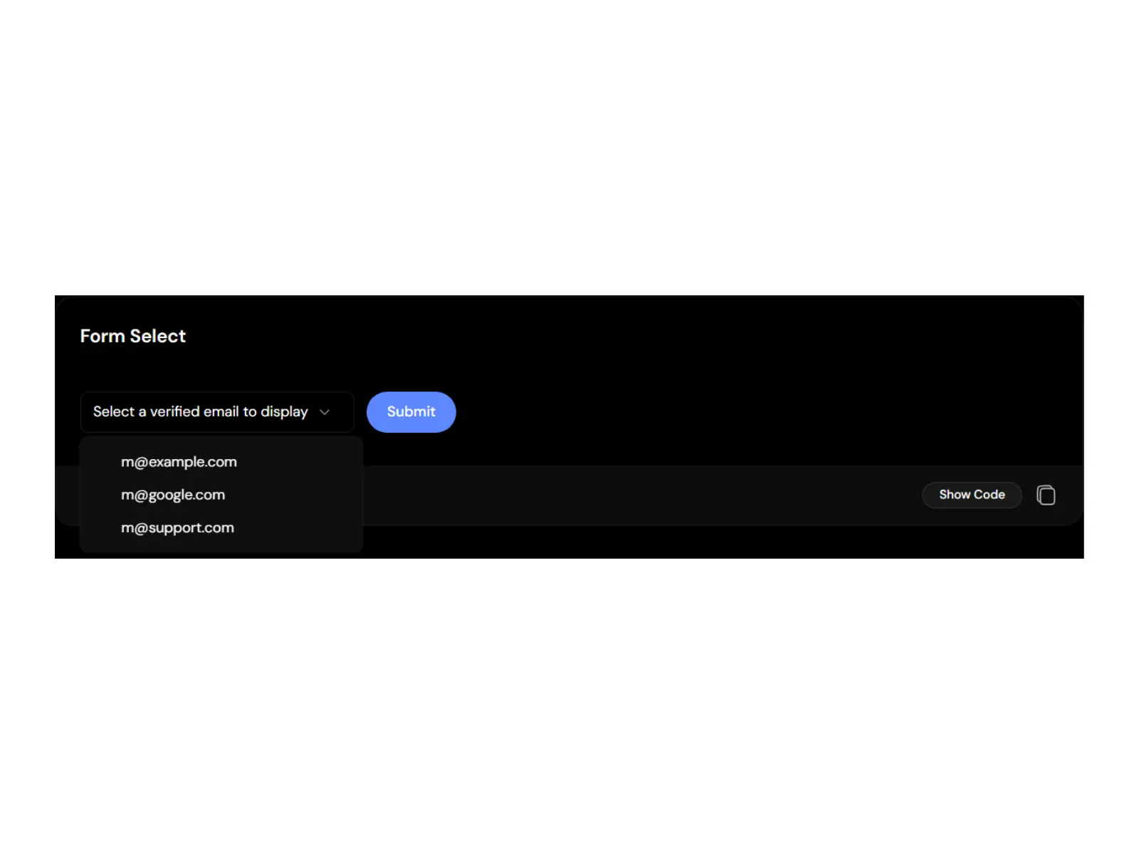
    Form Select with Submit Button

    This pattern pairs a select with a submit action and validates the choice end-to-end. The official reference builds it with a resolver and schema, so an invalid pick shows a message and stops the submission. You get the value back in a typed shape through onValueChange, which keeps the handler clean and predictable.

    Use cases:

    • Email display pickers with 3 verified options
    • Settings forms that save on submit
    • Single-question forms with strict rules
    • Profile updates needing one confirmed value
    • Inline filters that apply on submit

    Best for: Inline forms that validate one choice and save it.

    Select with Timezone
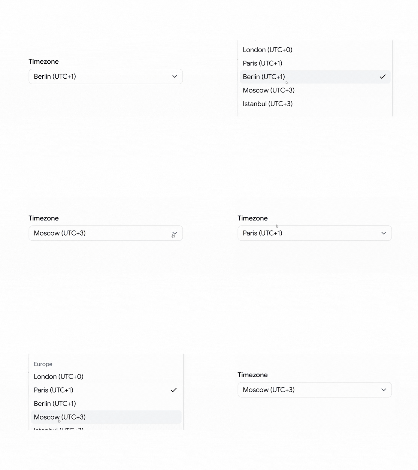
    Select with timezone

    This pattern groups a long option list into labeled regions like North America and Europe, so users can find their zone fast. The reference example scrolls through 30+ zones across 5 region groups inside one pop-up. Each zone maps to a single stored value, so the state stays clean even when the list is long.

    Use cases:

    • Scheduling tools that need a user’s timezone
    • Calendar settings for global teams
    • Meeting booking with regional clarity
    • Account preferences for date display
    • Server config screens with zone selection

    Best for: Long option lists that need scrolling and groups.

    Select with Overlapping Label
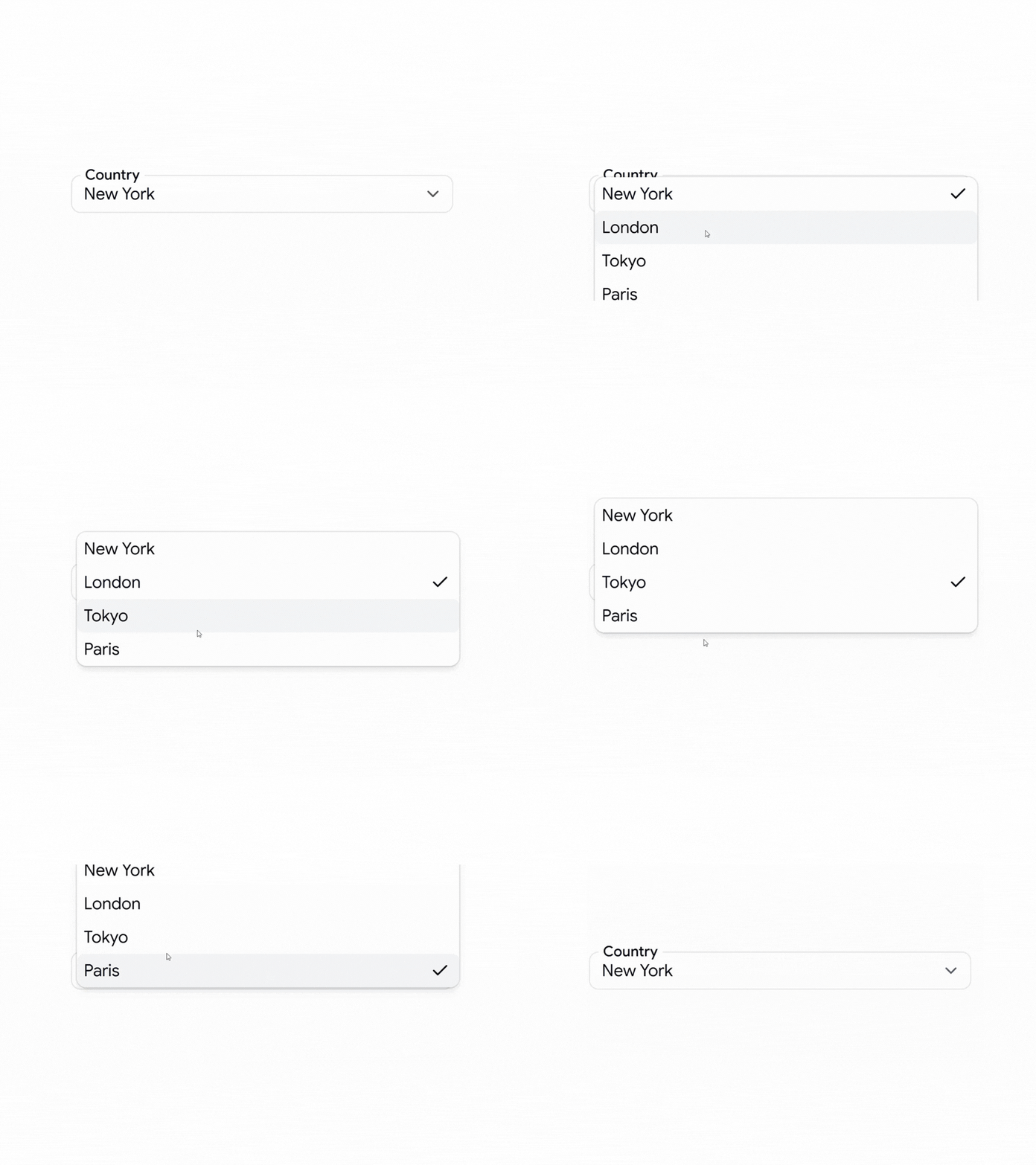
    Select with overlapping label

    This pattern floats the label over the trigger border, which saves vertical space in a dense form. The field stays labeled at all times, so users who jump around a long form never lose context. You control the float position and spacing with Tailwind classes, and the label still ties to the input for assistive tech.

    Use cases:

    • Dense onboarding forms with many fields
    • Compact settings panels in admin tools
    • Multi-step wizards that conserve height
    • Forms built for small mobile viewports
    • Profile editors packed with inputs

    Best for: Tight forms where vertical space is scarce.

    Select with Multiple Options
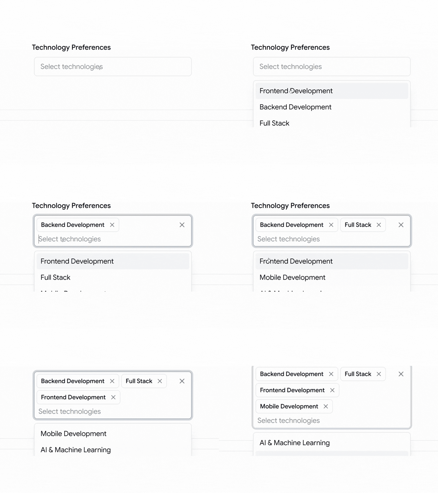
    Select with multiple options

    This pattern lets a user pick several values from one control instead of a wall of checkboxes. You manage the array of selected values, so validation can check a minimum count or a required pick. The trigger reflects how many items are chosen, which keeps the current state readable without opening the pop-up.

    Use cases:

    • Skill or technology preference pickers
    • Tag selectors across multiple categories
    • Filter panels needing several active values
    • Permission screens pick many roles
    • Interest selection during onboarding

    Best for: Fields where users need more than one value.

    Select with Avatars
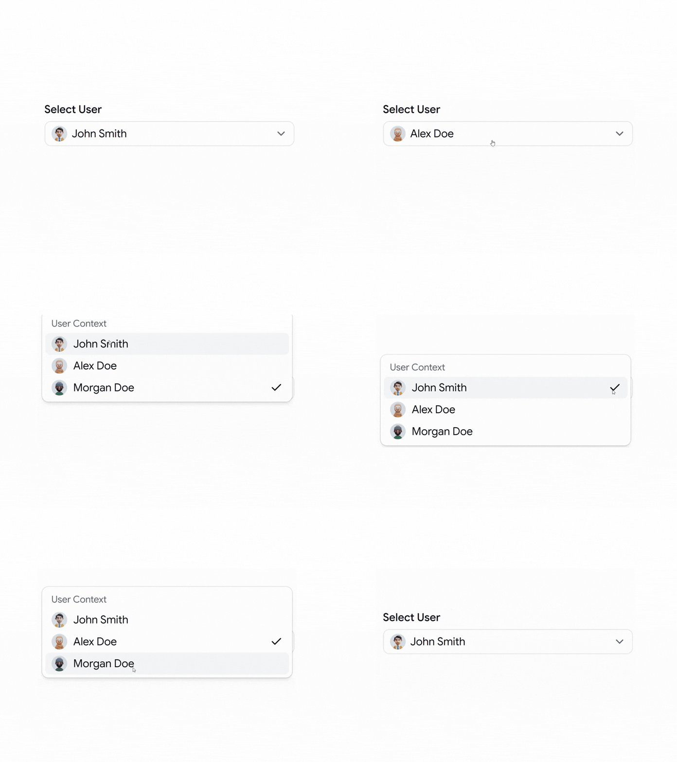
    Select with avatars

    This pattern shows a user image next to each name, which speeds up picking people from a list. Assignment fields and mention pickers read faster when a face backs the label. You supply the avatar source per option, so the list stays in sync with your user data and the trigger shows the chosen person clearly.

    Use cases:

    • Task assignment to team members
    • Reviewer pickers on pull requests
    • Owner fields in CRM records
    • Mention selection inside comments
    • Account switchers in multi-user apps

    Best for: Picking a person from a known group.

    Select with Leading Text
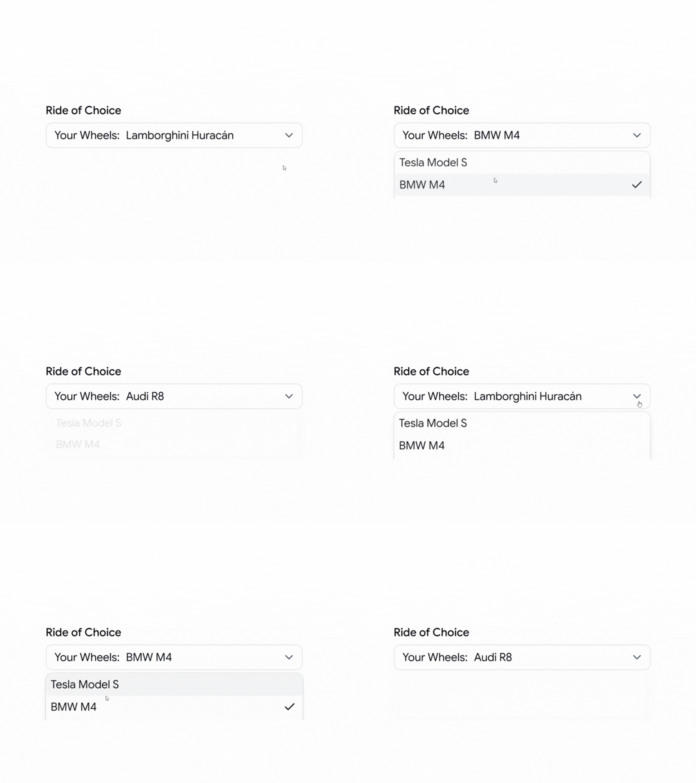
    Select with leading text

    This pattern adds fixed prefix text inside the trigger, like “Your Wheels:”, so the value reads as a full phrase. The prefix frames the choice without spending a separate label line above the field. Only the trailing value changes on selection, so the state stays simple, and the context stays clear.

    Use cases:

    • Plan pickers with a fixed prefix
    • Vehicle or product choosers
    • Preference fields that need framing
    • Pricing tier selectors
    • Config fields with a label phrase

    Best for: Choices that need a fixed prefix for context.

    Select with Separator
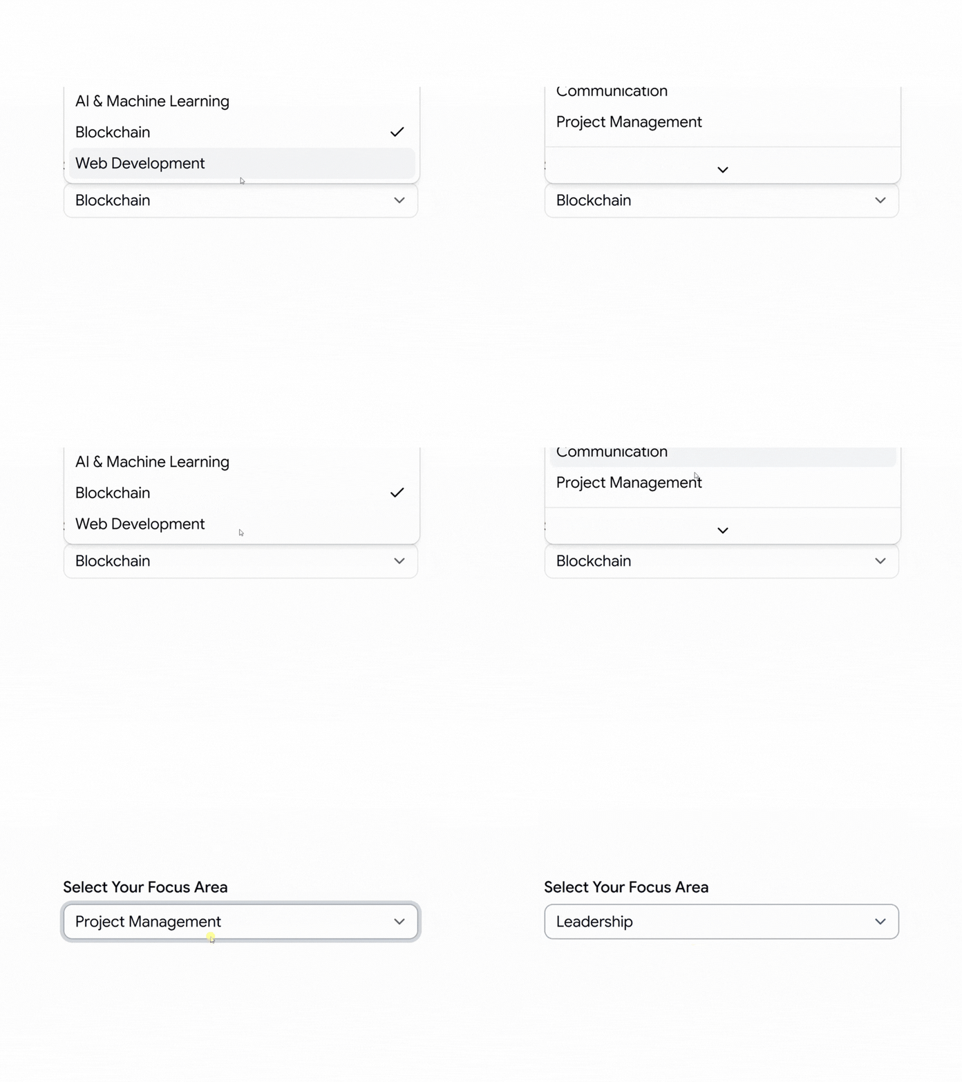
    Select with separator

    This pattern uses separators to split options into clear sections inside one list. It helps when a single select holds distinct groups, like focus areas or departments. You add the separators and labels yourself, so the grouping matches your data, and users make fewer wrong picks as the list grows.

    Use cases:

    • Department pickers split by team
    • Focus area selectors with sections
    • Menus mixing actions and items
    • Category lists with subgroups
    • Settings grouped by type

    Best for: A single list that needs visible section breaks.

    Align Item with Trigger
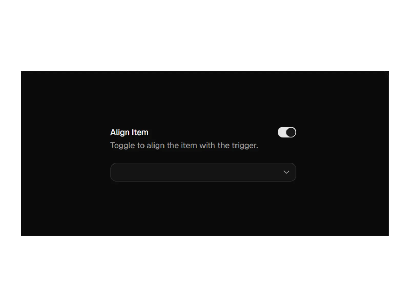
    Align Item with Trigger

    This pattern uses the position prop on the content to control the pop-up alignment. With position=”item-aligned”, the selected item sits over the trigger, and with position=”popper”, the pop-up aligns to the trigger edge. The official docs show both, which matters when a select sits in a dense table or a scroll area.

    Use cases:

    • Inline edits where the value stays in place
    • Dense tables with row-level selects
    • Compact toolbars holding dropdowns
    • Forms where pop-up placement matters
    • Edge-aligned filters on narrow screens

    Best for: Controlling exactly where the pop-up opens.

    Group Select
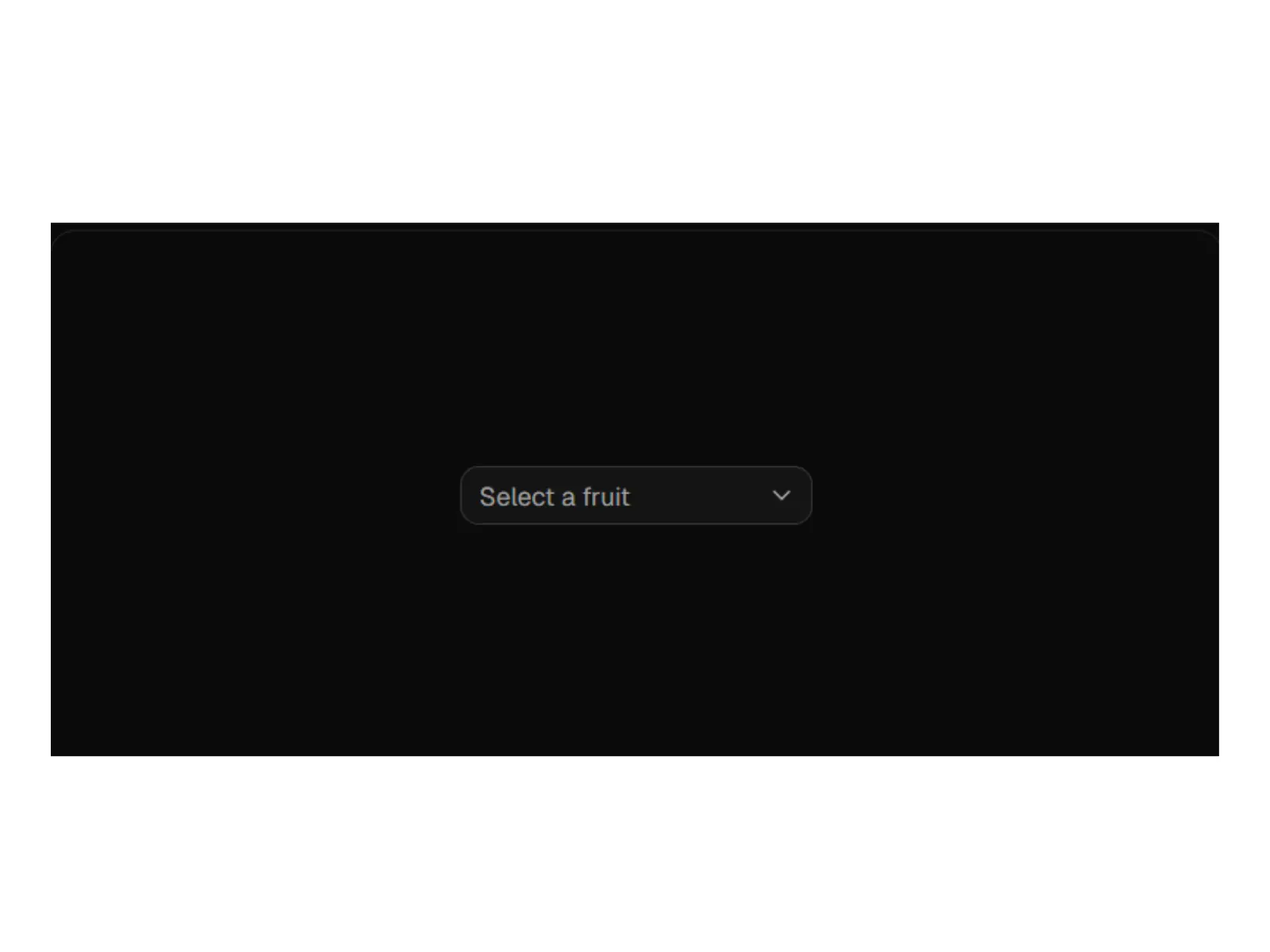
    Group Select

    This pattern uses group, label, and separator parts to organize items, as the official docs describe. It turns one long list into labeled clusters that follow your domain. Grouping cuts scan time and reduces wrong picks once the list grows past a handful of options.

    Use cases:

    • Product lists split by type
    • Region pickers grouped by continent
    • Settings grouped by category
    • Command-style lists with sections
    • Catalog filters with grouped values

    Best for: Long lists that read better in named groups.


    When to Use Select vs Combobox vs Radio Group

    Picking the right control matters as much as styling it. Here is how we decide.

    Use a select when a user picks one value from a known list of roughly 5 to 30 items, like a status, role, or timezone. The list is fixed, the user does not need to type, and you want a compact trigger.

    Use a combobox when the list is long, or the user benefits from typing to filter. Country lists, product catalogs, and user search all read faster with type-ahead. A plain select forces scrolling, and that gets slow past 30 or so options.

    Use a radio group when there are only 2 to 4 options, and they all matter at a glance. Radios show every choice at once, so the user skips the extra click of opening a pop-up.

    Quick rule: short and visible goes to radio, long and searchable goes to combobox, and everything in between goes to select.


    Real-World Use Cases

    Forms

    Pair the select component with a schema validator to prevent invalid submissions and ensure you receive correctly typed values.

    Settings Pages

    Use it to manage options like timezone, language, and other account preferences without cluttering the user interface.

    Admin Dashboards

    Use it to handle status updates and assignment changes without adding unnecessary complexity.

    User Onboarding

    Employ multiple-option and avatar patterns to help new users set their preferences quickly and intuitively.

    Data Filtering

    Use it to organize large sets of filter options and make complex searches easier to navigate.


    FAQ’s

    1. Can I customize the Shadcn select?

    Yes. Since the code is copied directly into your project, you have full control over styling and functionality. You can modify the CSS classes to match your design system, change animations, or add custom logic to the component’s behavior without needing to override styles from an external library.

    2. How do I use shadcn select with forms and validation?

    Wrap the select in your form field and connect it to a schema validator. The official form example uses a resolver and a schema, so an invalid pick shows a message and blocks the submit. The onValueChange handler updates your form state, and data-invalid plus aria-invalid mark the error so screen readers catch it too.

    3. When should I use select instead of another input?

    Use a select when users pick one value from a known, medium-length list, like a status, role, or timezone. For two or three options, radio buttons read faster. For long, searchable lists, a combobox or command menu beats a select. If users need many values at once, reach for the multiple-options pattern.


    Final Thoughts

    Select is a small control that touches almost every form, filter, and settings screen you ship. The patterns here cover the cases that actually come up: required fields, status flows, grouped lists, time zones, avatars, multi-select, and validated submits.

    Each one runs on Radix UI or Base UI, installs through a single CLI command, and lands in your repo as code you control.

    Start with the required select and the form select if you are building forms today. Add the status and grouped patterns as your screens grow. Pick the one that matches your layout, paste it in, and wire it to your state and validation.

    Additionally, if you’re looking for ecommerce templates, explore our guide on the best ShadCN Ecommerce templates, which provides step-by-step instructions to get started.
  • 10+ Best Angular Admin Dashboard Templates for 2026

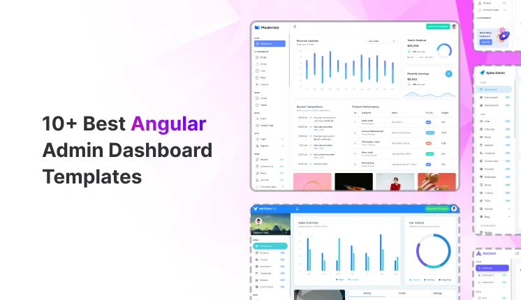
    10+ Best Angular Admin Dashboard Templates for 2026

    Angular remains a strong choice for building internal tools, SaaS admin panels, analytics dashboards, and data-intensive back offices. Teams pick Angular for its structure, long-term support, and clear separation of concerns.

    In this guide, developers will learn which free Angular admin dashboard templates are stable enough for real-world projects, how each option fits common use cases such as SaaS analytics, website analytics, and internal admin tools, and what types of dashboard pages, components, and layout structures are included.

    It also highlights which projects are actively maintained and safe to extend in 2026, helping teams avoid outdated or unusable dashboards and choose a reliable starting point faster.

    This blog focuses only on free Angular admin dashboard templates that are actively used, publicly maintained, and backed by real GitHub repositories – not UI mockups or abandoned demos.


    Why developers should trust this list

     We evaluated each Angular dashboard template based on:

    • Live GitHub repositories (stars, issues, commit history)
    • Angular-first architecture (real components, services, routing)
    • Dashboard depth (number of dashboard variations, charts, tables, admin pages)
    • Production usage signals (community adoption and long-term maintenance)
    • Clear tech stack alignment (Angular version, UI framework, styling approach)

    Every template listed here is used by developers building SaaS analytics dashboards, admin panels, or internal systems.


    How to choose the right Angular admin dashboard

    Before picking any Angular admin template, developers usually evaluate:

    • How many dashboard layouts are included (analytics, admin, overview)
    • Whether tables, forms, and charts are already wired to components
    • If the folder structure supports scaling without refactoring
    • Angular version compatibility for future upgrades
    • How much code needs to be removed before starting real development

    The following templates meet these criteria and work as a real starting point, not just a UI preview.


    Top Free Angular Admin Dashboard Templates

    These Angular dashboard templates address common needs, including SaaS analytics, website analytics, internal reporting, and admin CRUD panels.


    Modernize

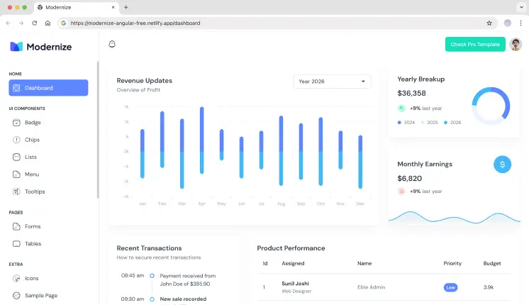
    Modernize Angular Template

    Modernize is a free Angular admin dashboard built on Angular Material, focused on analytics and basic admin layouts. It provides a small set of dashboard pages, charts, tables, and form components suitable for internal tools and SaaS analytics MVPs. The project structure follows standard Angular module patterns, making it easy to extend without refactoring the layout. Best suited for teams starting with Angular Material and needing a clean base.

    • Single dashboard layout (analytics-focused)
    • 5+ UI Components for dashboard layout
    • 4+ Pre-designed Pages (like Sample, Icons, Login, Register)
    • Angular Material table examples with pagination
    • Sidebar + header layout using Material components

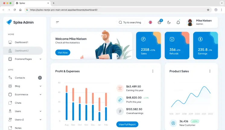
    Spike

    Spike Angular Admin Dashboard Template

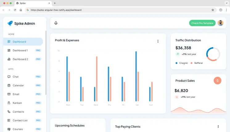
    Spike is a lightweight Angular admin template designed for simple dashboards and internal panels. It includes a small number of analytics widgets, charts, and admin pages without deep abstraction layers. The codebase stays close to Angular defaults, which helps when integrating custom APIs or removing unused sections. Suitable for quick admin setups and small internal tools.

    • Single dashboard layout 
    • 7+ Page Templates & 10+ UI Components
    • Simple routing with page-level components
    • Minimal layout structure for quick customization
    • Low component coupling for easy removal

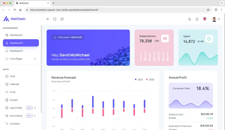
    MatDash

    Matdash Angular Admin Dashboard Template

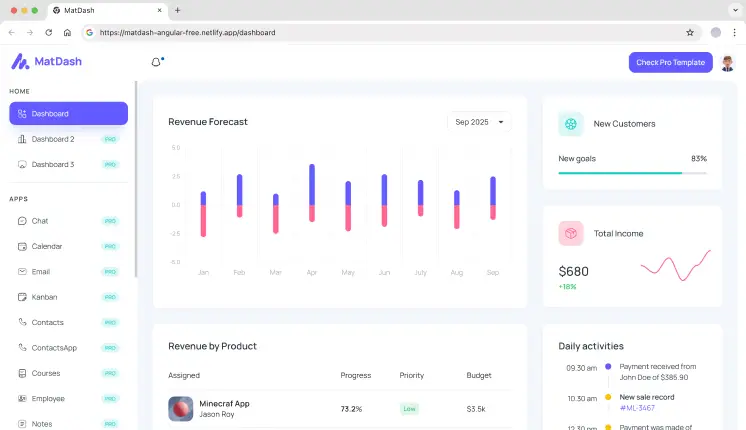
    MatDash is a minimal Angular Material dashboard that focuses on core admin UI elements. It includes a basic dashboard view, Material tables, and form components without additional design layers. The template works well as a starting point for custom enterprise dashboards where developers want full control over features and data flow.

    • Single dashboard layout with stat widgets
    • 7+ UI components for dashboard layout
    • 4+ Pre-designed Pages (like Sample, Icons, Login, Register) 
    • Angular Material table and form examples
    • Material theming setup

    MaterialM

    MaterialM Free Angular Material Template

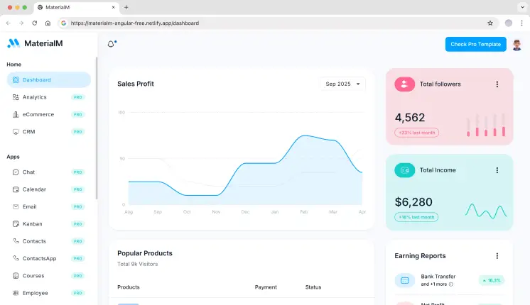
    MaterialM is built for newer Angular projects and follows Angular 21 standards with Angular Material components. It includes dashboard widgets, charts, and admin pages structured for modern Angular workflows. This template is useful when starting a fresh Angular project and avoiding legacy patterns.

    • Single dashboard layout
    • 7+ Page Templates & 10+ UI Components
    • Material-based layout and navigation
    • Modular component structure
    • Well-explained documentation

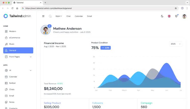
    Tailwindadmin

    Tailwindadmin Angular Template

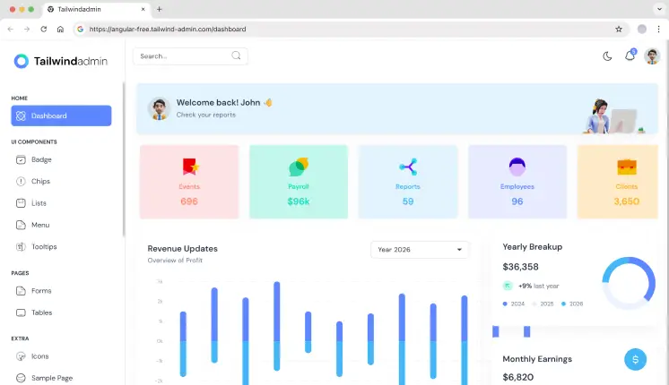
    Tailwindadmin is a modern Angular admin dashboard built with Tailwind CSS & Angular Material. It provides analytics-based dashboard layouts, analytics widgets, and admin pages using utility-first styling. This approach gives developers direct control over UI structure without overriding component libraries.

    • Single dashboard layout
    • 10+ UI Components & 3 Page Templates
    • Tailwind utility-based UI structure
    • 2 web apps & 3 Comprehensive charts
    • Dark & Light Mode Support

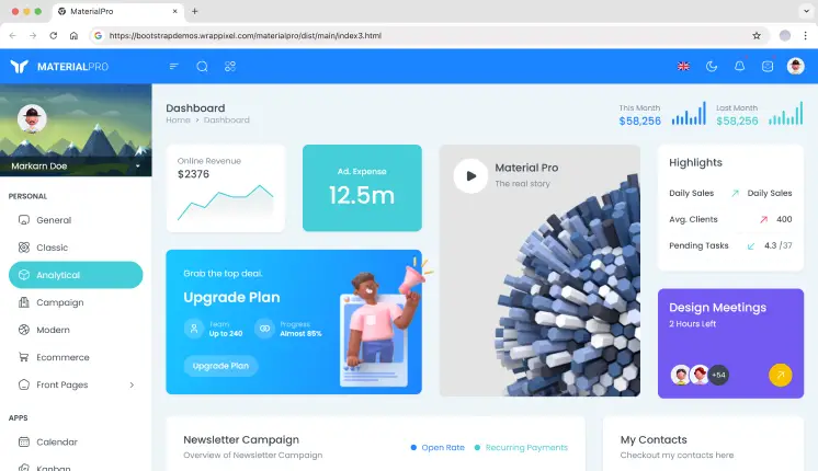
    MaterialPRO

    MaterialPro Free Angular Material Template

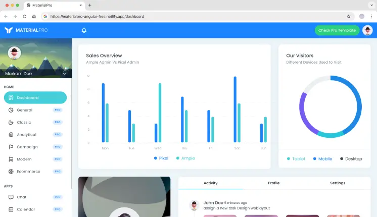
    MaterialPRO is a popular Angular Material admin template designed for building dashboards and admin interfaces. It comes with ready-to-use analytics views, tables, forms, and essential utility pages. The well-organized structure makes it easy to extend and maintain as projects grow.

    • Single dashboard layout
    • 7+ Page Templates & 10+ UI Components
    • Includes Auth Pages like Login & Register
    • Form-driven admin pages
    • Stable layout used in long-running projects

    Ng-Matero

    Matero MaterialM Free Angular Material Template

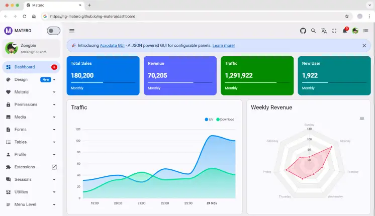
    Ng-Matero is an Angular Material admin template that balances simplicity and flexibility. It includes multiple dashboard layouts, structured routing, and admin utilities commonly needed in internal dashboards. Developers often use it as a clean base for analytics or reporting tools.

    • Multiple dashboard layouts
    • Angular Material component usage
    • Supports Internationalization
    • HTTP interceptors & Powerful color system
    • Includes RBAC Support

    Ngx-Admin

    NGX MaterialM Free Angular Material Template

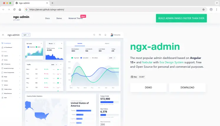
    Ngx-Admin is a feature-rich Angular admin framework used in large-scale applications. It includes multiple dashboard types, advanced theming, and layout options designed for complex data-driven systems. Due to its size, teams usually delete unused modules before production use.

    • 3+ dashboard types (like analytics, IoT, and eCommerce)
    • 40+ Angular Components
    • 60+ Usage Examples
    • Theme switching system
    • Strong community-driven maintenance

    Sakai

    Sakai Angular Material Template

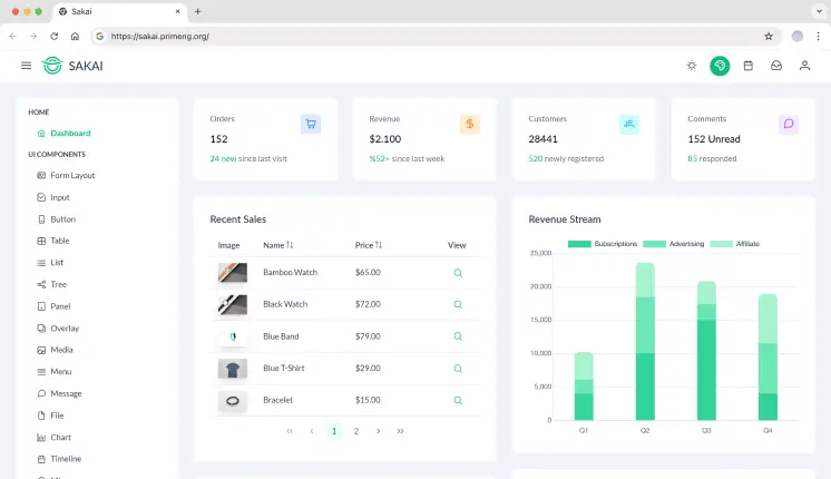
    Sakai is an Angular admin dashboard built to showcase PrimeNG components in a real application layout. It includes dashboard pages, charts, and data tables implemented using PrimeNG. Best suited for teams already committed to the PrimeNG ecosystem.

    • 5+ Pre-designed Pages (like Auth, 404, Empty, CRUD, etc.)
    • 15+ UI Components for dashboard layout
    • PrimeNG-based dashboard layouts
    • Dark & Light Mode Support
    • Good reference for PrimeNG usage

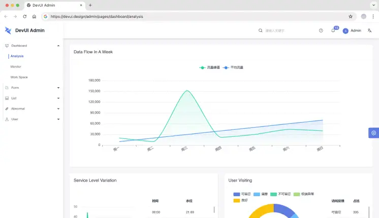
    DevUI Admin

    Dev UI Angular Material Template

    DevUI Admin is built for enterprise-style Angular applications using the DevUI component system. It focuses on form-heavy admin workflows, large tables, and structured navigation. This template is commonly used for internal enterprise systems rather than public-facing dashboards.

    • Enterprise-focused admin layout
    • Includes Mock Data
    • Supports Internationalization
    • Clear navigation for complex apps
    • Component-driven architecture

    Frequently Asked Questions

    Tailwindadmin and Modernize are commonly used for SaaS analytics due to multiple dashboard layouts, chart coverage, and scalable structure.

    Yes. Most teams use them as a base layer. You should still review code quality, remove unused modules, and align services with your backend.

    Choose Angular Material for consistency and long-term maintenance. Choose Tailwindadmin if you want UI control and faster layout customization.


    Final Thoughts

    Angular admin dashboards save weeks of setup time when building analytics tools, SaaS back offices, or internal platforms. The templates listed here are developer-tested, repo-backed, and suitable for real projects – not demos.

    Select a template based on your preferred tech stack, dashboard complexity, and long-term maintenance requirements, rather than visual appeal.

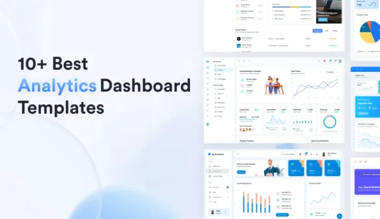
  • 10+ Best Analytics Dashboard Templates for 2026

    10+ Best Analytics Dashboard Templates for 2026

    When you’re working with data, the right analytics dashboard template can change how you interpret and manage it. In today’s world, making smart decisions based on clear and actionable insights is more crucial than ever. If you’re working in business intelligence, marketing, or any data-driven field, these templates will help you showcase the data in a way that’s both easy to understand and impactful.

    Why You Need the Best Analytics Dashboard Templates

    As the world gets faster and faster, the importance of analytics and on-the-fly decision-making becomes increasingly critical. A well-designed analytics dashboard helps teams monitor SaaS metrics, website traffic, or product usage in one place – reducing manual reporting and enabling faster, data-backed decisions. As we approach the year 2026, the most important dashboard templates will be able to be tailored to the user in trend monitoring, KPI tracking, and actionable data reporting.

    Checklist: Key Features of an Analytics Dashboard Template

    Before we dive into our top 10+ free and premium templates, we’ve prepared a checklist for the analytics dashboard features that you will want to have:

    • Customization Options: Can developers reconfigure layouts, components, and data views without rewriting core logic?
    • Data Integration Readiness: Does it support real-time or async data sources (REST, GraphQL, WebSockets)?
    • Responsive Design: Does the dashboard adapt cleanly across desktop, tablet, and mobile views for on-the-go analytics monitoring?
    • Pre-made Widgets: Does it include essential widgets like line, bar, and pie charts, tables, and graphs to efficiently display your data?
    • Tech Stack Compatibility: Is the template built on production-ready frameworks (Next.js, React, Angular) suitable for scaling SaaS and analytics products?

    Now you know what to keep an eye out for, let’s explore the best analytics dashboard templates for 2026.

    Best Analytics Dashboard Templates

    We reviewed each template based on developer experience, real-world analytics use cases (SaaS metrics, website analytics, product tracking), tech stack maturity, extensibility, and performance in production-grade dashboards.

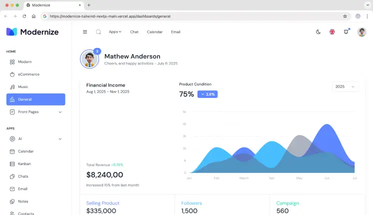
    Modernize Next.js Tailwind

    Modernize Analytics Dashboard Template

    Modernize Next.js Tailwind is a Next.js admin template integrated with Tailwind CSS that offers a sleek, modern, and minimalist design for developing modern web applications and dashboards faster.

    Key Features:

    • SEO friendly with SSR
    • Built with Next.js v16 and Tailwind CSS v4 for a perfect balance of speed and flexibility
    • 5+ Pre-built Layouts & 150+ Dashboard UI Components
    • Data is easily visualized with pre-built charts and graphs
    • Optimized layout system for dense analytics views and KPI-heavy screens

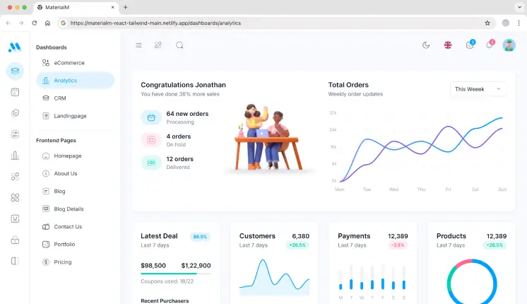
    MaterialM Tailwind React

    MaterialM Analytics Dashboard Template

    MaterialM Tailwind React is super easy to customize. Having modern design trends makes it a great tool for creating scalable dashboards and analytics applications. 

    Key Features:

    • Fast & responsive UI is powered by React and Tailwind CSS
    • Component-driven structure ideal for scaling analytics views
    • Widgets are available for charts, tables, and graphs
    • Seamless integration with backend services and APIs
    • Comes with 65+ Page Templates

    MatDash Angular

    Matdash Analytics Dashboard Template

    An Angular dashboard template designed for easy integration. It offers a set of reusable components and a highly customizable layout. Best for: Enterprise analytics dashboards with complex data flows.

    Key Features:

    • Developed with Angular 20 version to ensure it’s dynamic and capable of handling a lot of data
    • 6+ Demo Pages 
    • Comes with charts, tables, and other data visualization tools
    • Easy-to-use and well-documented
    • 12+ Pre-built applications 

    Spike Next.js

    Spike Analytics Dashboard Template

    This is a premium Next.js dashboard designed for richly SEO-optimized applications and webpages. Because of its great user experience, it is ideal for applications centered on analytics, CRM, and others.

    Key Features:

    • 65+ Pre-built Page Templates and 12+ ready to use applications
    • Built with Next.js v15 for performance and scalable applications
    • Interactive visualization through charts, tables, and graphs
    • Easy customization with reusable components
    • SSR-ready architecture for analytics pages requiring fast initial load

    MaterialPRO Bootstrap

    MaterialPro Analytics Dashboard Template

    MaterialPRO is a powerful Bootstrap admin template. It was designed to serve data-driven dashboards and analytical applications. Best for: Legacy systems or teams standardizing on Bootstrap-based analytics dashboards.

    Key Features:

    • Built with Bootstrap v5
    • 500+ UI Components and Page Templates
    • Extensive array of charts, tables, and forms
    • Grid-based layout system for structured analytics views
    • Compatible with all browsers

    Tailwindadmin React

    Tailwindadmin Analytics Dashboard Template

    Tailwindadmin is a modern dark theme React admin template for very critical applications, which is inspired by Material Design created by Google. It is system-oriented with a polished style and is fully responsive for all devices, like desktop and mobile.

    Key Features:

    • Built using React v19 & Tailwind CSS v4 , providing a lightning-fast UI
    • 4+ Pre-built Demo Pages (Includes Horizontal, RTL, Mini Sidebar Versions)
    • Tools for visualizing data in the form of graphs and charts
    • Customization is simple and easy
    • Dark mode is designed for data-heavy dashboards

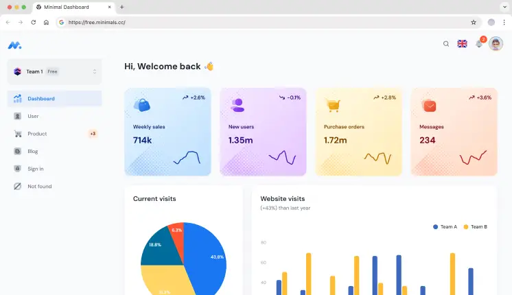
    Minimal Dashboard

    Minimal Analytics Dashboard Template

    Minimal Dashboard is a sleek and modern template for an admin dashboard. While it is simple, it is also very powerful and provides an experience for designers who want a design with powerful functions, but simple and easy to use.

    Key Features:

    • Minimal UI optimized for focused analytics and KPI monitoring
    • Flexibly Layout adjusts to your needs
    • Real-time data rendering
    • The user interface is simple in design for simple navigation
    • Pre-integrated with important charts and tables

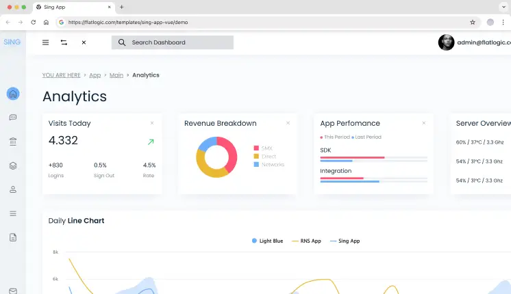
    Sing App

    Sing App Analytics Dashboard Template

    Sing App is a lightweight and simple admin template. It includes a complete set of pre-built UI components and powerful features to help you create dashboards faster.

    Key Features:

    • Built using Vue.js, which allows for rapid, fast & dynamic updates
    • Complete set of UI components, including tables, charts, and forms
    • Complete responsiveness to multiple screen sizes
    • Multiple pre-built design layouts and color themes
    • Vue-based structure suitable for custom analytics workflows

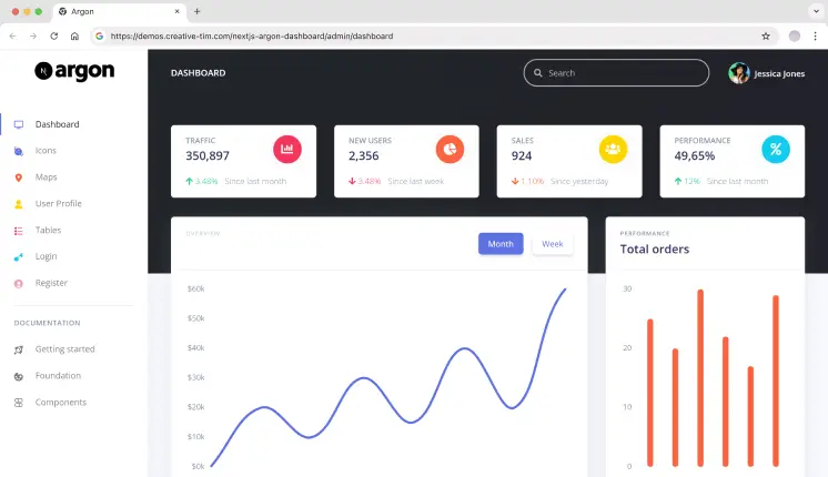
    Argon

    Argon Analytics Dashboard Template

    Argon is a free Next.js dashboard template focused on clean code, easy customization, and modern components with the ability to build fully-featured dashboards.

    Key Features:

    • Build with Next.js for better performance and SEO 
    • Beautiful design based on the Argon design system 
    • Several ready-made pages and UI elements 
    • Clean component structure for building analytics dashboards quickly
    • Integrated with high-quality charts and graphs

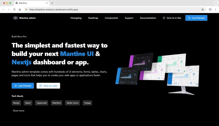
    Mantine

    Mantime Analytics Dashboard Template

    Mantine is a modern React library that provides a set of high-quality React components and hooks. This template is designed for developers who want to build dashboards with an elegant and flexible design quickly. 

    Key Features:

    • Comes with ready-to-use UI components, including charts, forms, and tables
    • Customizable theme and layout options 
    • Hook-based architecture for building interactive analytics experiences
    • Comes with a lot of features such as modals, notifications, and more 
    • Easy to integrate with React applications

    Frequently Asked Questions

    These templates are highly modular for easy customization. You are free to change layouts, colors, and different widgets as needed. Most templates include documentation and modular components, making them suitable for custom analytics requirements.

    Yes. These templates are designed to handle real-time and large datasets commonly used in SaaS analytics, website tracking, and internal reporting systems.

    Yes, these templates are designed for simple interfacing with your backend systems. Whether you are using a REST API, GraphQL, analytics services, or data pipelines, the templates are flexible enough to be integrated without any hassle.

    Final Thoughts

    Choosing the right analytics dashboard template depends on your technical stack and the type of analytics you’re building.

    Modernize Next.js Tailwind and MaterialM Tailwind React are well-suited for teams building SaaS analytics or website analytics dashboards that require fast iteration and a modern Tailwind-based workflow.

    Spike Next.js stands out for developers who need strong SEO, server-side rendering, and production-ready performance for public-facing analytics pages.

    For Angular-based teams working on enterprise-scale analytics with complex data flows, MatDash Angular offers a structured and scalable foundation.

    Each template in this list was selected based on real-world analytics use cases, framework maturity, and the ability to scale as data complexity grows.