Angular remains a strong choice for building internal tools, SaaS admin panels, analytics dashboards, and data-intensive back offices. Teams pick Angular for its structure, long-term support, and clear separation of concerns.
In this guide, developers will learn which free Angular admin dashboard templates are stable enough for real-world projects, how each option fits common use cases such as SaaS analytics, website analytics, and internal admin tools, and what types of dashboard pages, components, and layout structures are included.
It also highlights which projects are actively maintained and safe to extend in 2026, helping teams avoid outdated or unusable dashboards and choose a reliable starting point faster.
This blog focuses only on free Angular admin dashboard templates that are actively used, publicly maintained, and backed by real GitHub repositories – not UI mockups or abandoned demos.
Why developers should trust this list
We evaluated each Angular dashboard template based on:
Live GitHub repositories (stars, issues, commit history)
Every template listed here is used by developers building SaaS analytics dashboards, admin panels, or internal systems.
How to choose the right Angular admin dashboard
Before picking any Angular admin template, developers usually evaluate:
How many dashboard layouts are included (analytics, admin, overview)
Whether tables, forms, and charts are already wired to components
If the folder structure supports scaling without refactoring
Angular version compatibility for future upgrades
How much code needs to be removed before starting real development
The following templates meet these criteria and work as a real starting point, not just a UI preview.
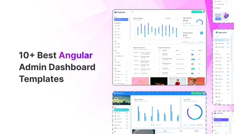
Top Free Angular Admin Dashboard Templates
These Angular dashboard templates address common needs, including SaaS analytics, website analytics, internal reporting, and admin CRUD panels.
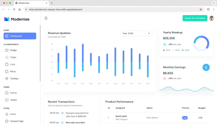
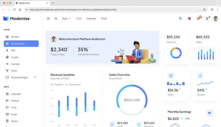
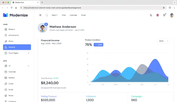
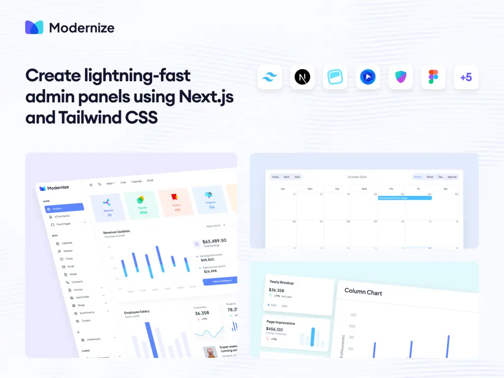
Modernize
Modernize is a free Angular admin dashboard built on Angular Material, focused on analytics and basic admin layouts. It provides a small set of dashboard pages, charts, tables, and form components suitable for internal tools and SaaS analytics MVPs. The project structure follows standard Angular module patterns, making it easy to extend without refactoring the layout. Best suited for teams starting with Angular Material and needing a clean base.
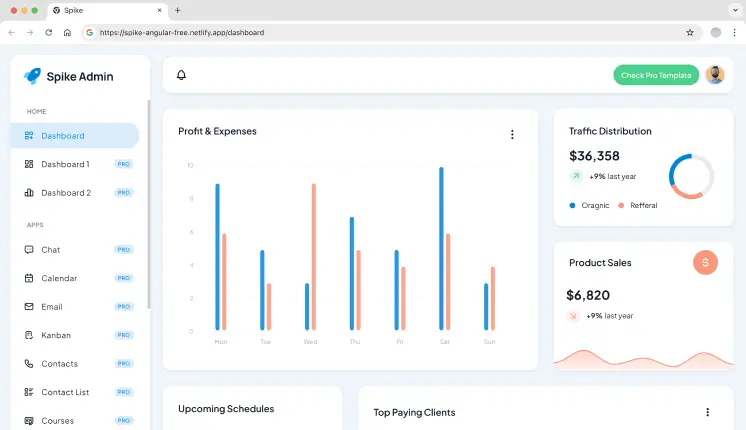
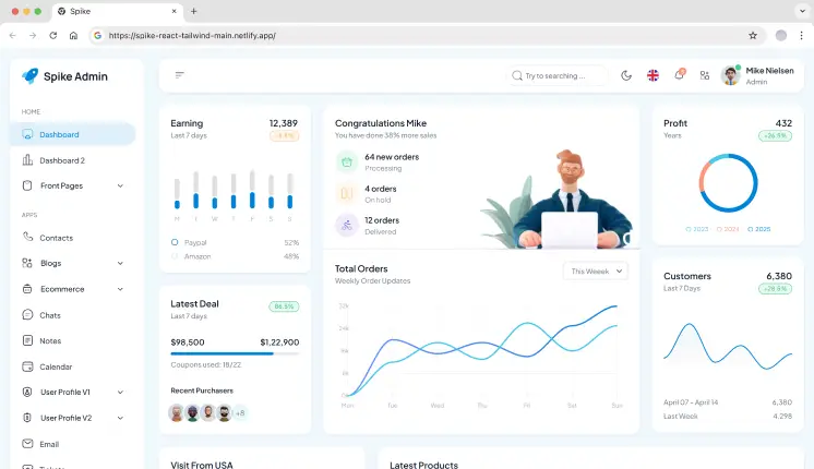
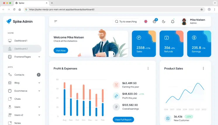
Spike is a lightweight Angular admin template designed for simple dashboards and internal panels. It includes a small number of analytics widgets, charts, and admin pages without deep abstraction layers. The codebase stays close to Angular defaults, which helps when integrating custom APIs or removing unused sections. Suitable for quick admin setups and small internal tools.
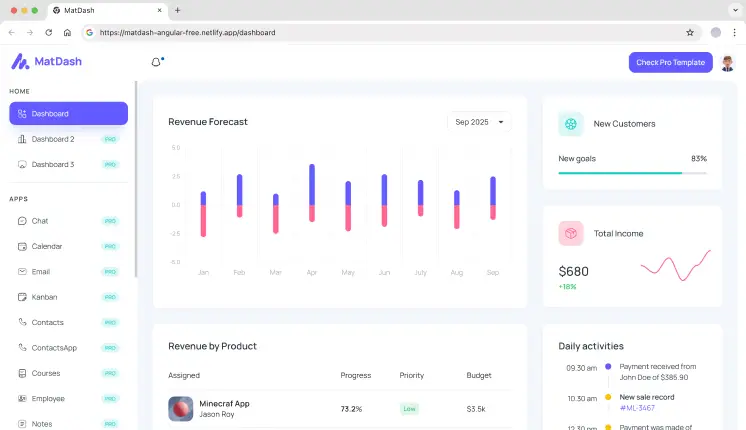
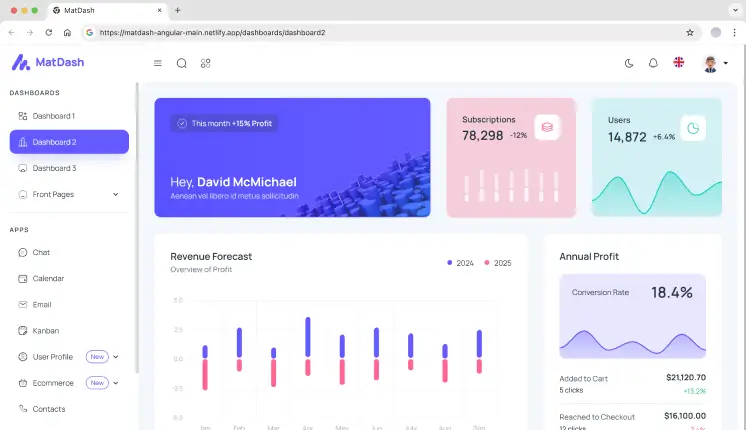
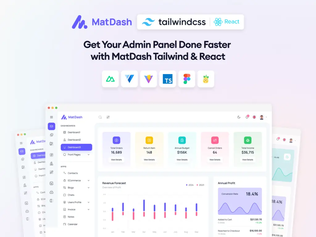
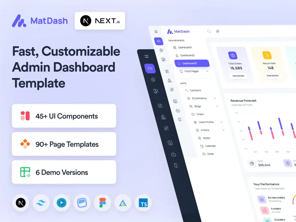
MatDash is a minimal Angular Material dashboard that focuses on core admin UI elements. It includes a basic dashboard view, Material tables, and form components without additional design layers. The template works well as a starting point for custom enterprise dashboards where developers want full control over features and data flow.
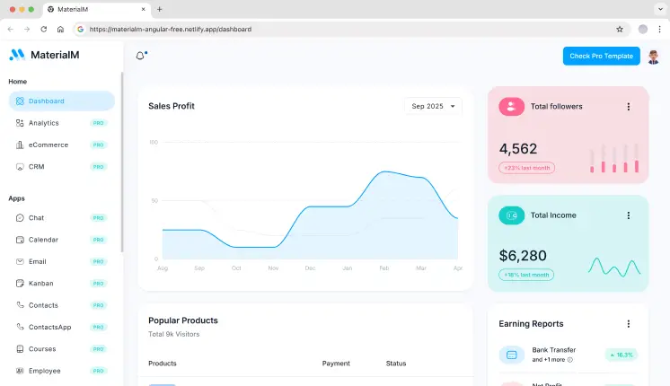
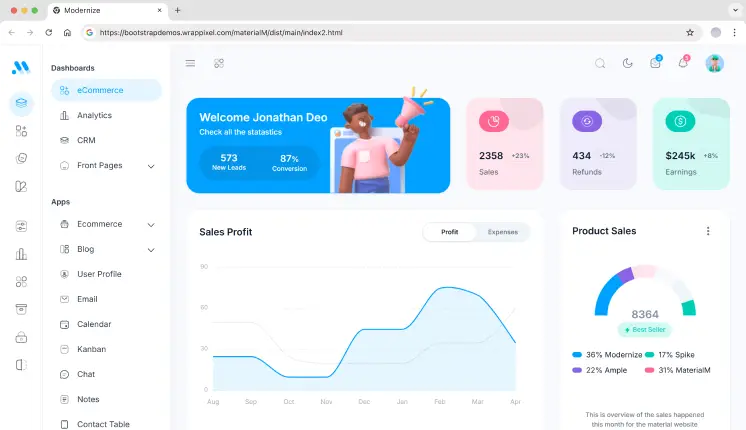
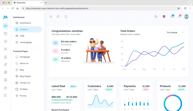
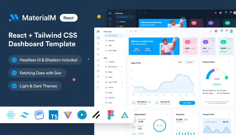
MaterialM is built for newer Angular projects and follows Angular 21 standards with Angular Material components. It includes dashboard widgets, charts, and admin pages structured for modern Angular workflows. This template is useful when starting a fresh Angular project and avoiding legacy patterns.
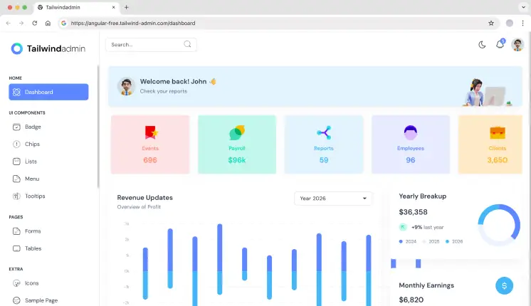
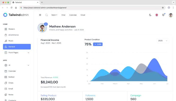
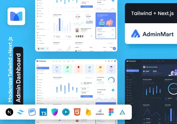
Tailwindadmin is a modern Angular admin dashboard built with Tailwind CSS & Angular Material. It provides analytics-based dashboard layouts, analytics widgets, and admin pages using utility-first styling. This approach gives developers direct control over UI structure without overriding component libraries.
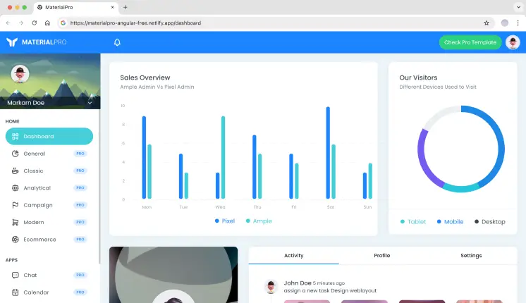
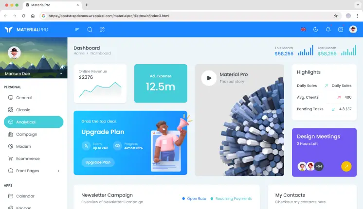
MaterialPRO is a popular Angular Material admin template designed for building dashboards and admin interfaces. It comes with ready-to-use analytics views, tables, forms, and essential utility pages. The well-organized structure makes it easy to extend and maintain as projects grow.
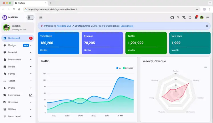
Ng-Matero is an Angular Material admin template that balances simplicity and flexibility. It includes multiple dashboard layouts, structured routing, and admin utilities commonly needed in internal dashboards. Developers often use it as a clean base for analytics or reporting tools.
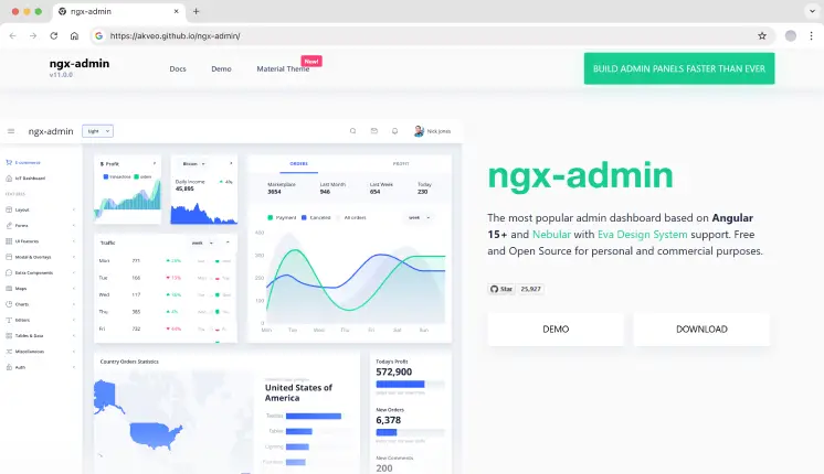
Ngx-Admin is a feature-rich Angular admin framework used in large-scale applications. It includes multiple dashboard types, advanced theming, and layout options designed for complex data-driven systems. Due to its size, teams usually delete unused modules before production use.
Tech stack: Angular v11, Nebular UI, TypeScript
GitHub stars: 25.9K+
Last updated: 2023
Key features
3+ dashboard types (like analytics, IoT, and eCommerce)
40+ Angular Components
60+ Usage Examples
Theme switching system
Strong community-driven maintenance
Best for: Enterprise dashboards, complex SaaS products
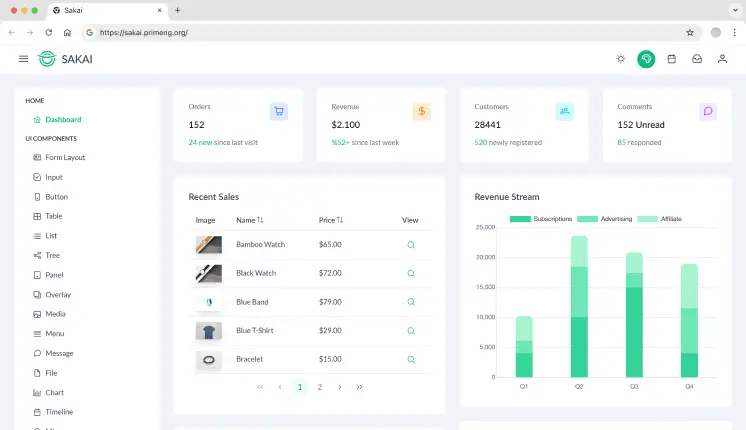
Sakai is an Angular admin dashboard built to showcase PrimeNG components in a real application layout. It includes dashboard pages, charts, and data tables implemented using PrimeNG. Best suited for teams already committed to the PrimeNG ecosystem.
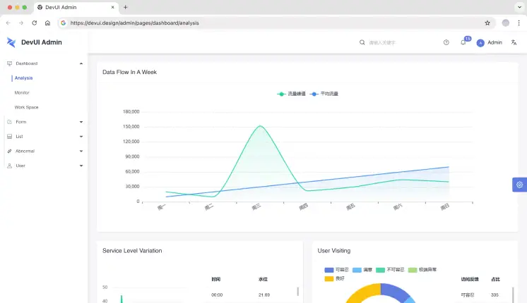
DevUI Admin is built for enterprise-style Angular applications using the DevUI component system. It focuses on form-heavy admin workflows, large tables, and structured navigation. This template is commonly used for internal enterprise systems rather than public-facing dashboards.
1. Which Angular admin dashboard is best for SaaS analytics?
Tailwindadmin and Modernize are commonly used for SaaS analytics due to multiple dashboard layouts, chart coverage, and scalable structure.
2. Are these Angular admin templates suitable for production?
Yes. Most teams use them as a base layer. You should still review code quality, remove unused modules, and align services with your backend.
3. Should I choose Angular Material or Tailwind-based dashboards?
Choose Angular Material for consistency and long-term maintenance. Choose Tailwindadmin if you want UI control and faster layout customization.
Final Thoughts
Angular admin dashboards save weeks of setup time when building analytics tools, SaaS back offices, or internal platforms. The templates listed here are developer-tested, repo-backed, and suitable for real projects – not demos.
Select a template based on your preferred tech stack, dashboard complexity, and long-term maintenance requirements, rather than visual appeal.
In 2026, digital commerce is changing every day, and the faster you launch, the better your chances of staying ahead. For web developers, building an entire e-commerce store from scratch is time-consuming and may not be a great investment.
That’s why more developers are using eCommerce dashboard templates. These templates come ready with a modern design, the latest tech stacks, and cross-framework compatibility out of the box.
Why Web Developers Trust This List
Front-end developers evaluate an e-commerce dashboard by its code structure, performance, and scalability, not just its visual design.
While hundreds of templates exist across marketplaces and third-party platforms, this list focuses on proven options. Modern dashboards now include essential pages, product listings, checkout flows, reusable components, and optimized widgets. They save time and help both startups and large businesses launch faster.
Product Management: Easily create, edit, and organize your products.
Order processing: Total orders dashboard, invoices & shipments.
User Management: Manage customers, users, permissions, and roles.
Visual Analytics: Deeply analyze how your sales are truly doing with interactive charts.
Live Insights: Live feed of charts, analytics, and reports that auto-update in real-time gives you the information on how your online ecommerce store is performing.
Best eCommerce Dashboard Templates
There are hundreds of templates available on eCommerce platforms and third-party resources; however, here are a few of the best ones. Today’s templates already include product pages, checkout flows, reusable components, and fast, optimized widgets. They save time and help both startups and large businesses launch faster.
Think of templates as your digital storefront; everything you need, from orders to sales insights.
Let’s have a look at the 10+ Freemium eCommerce templates for 2026.
These are some picks that developers favor because they utilize the latest tech stacks, beautiful UI, and are easy to integrate with other web frameworks.
Template
Framework Support
Dashboard Variations
Auth Support
Dark / RTL / i18n
Modernize
Multi-framework
5+
Built-in
✅ Yes
Spike
Multi-framework
4
Firebase
✅ Yes
Tailwindadmin
Multi-framework
4+
Firebase
✅ Yes
MaterialM
Multi-framework
3
Included
✅ Yes
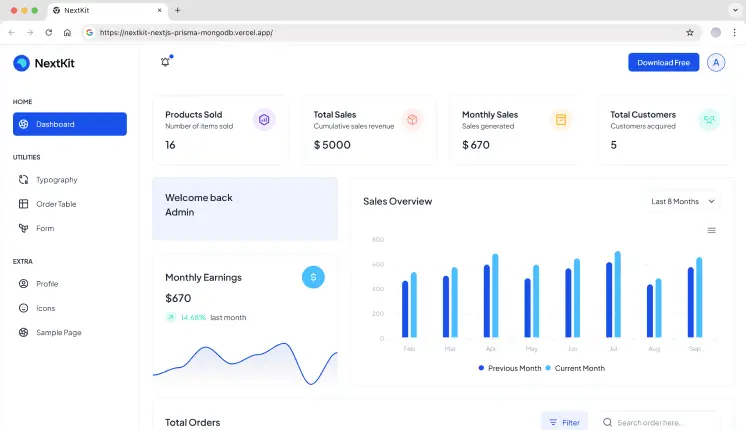
NextKit
Next.js
1
NextAuth, JWT
❌ No
DashNext
Next.js
1
NextAuth
✅ Yes
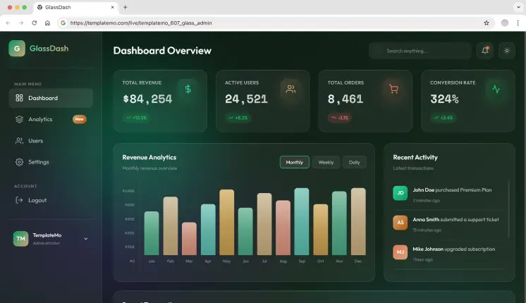
Glass Admin
HTML only
2
Login / Signup
✅ Yes
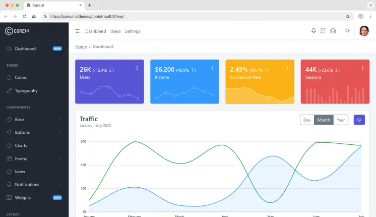
CoreUI
React, Vue, Angular, Laravel
1
Included
✅ Yes
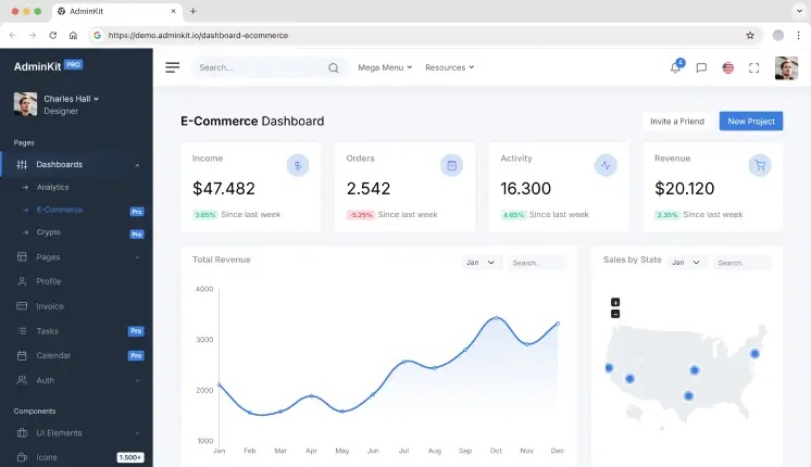
AdminKit
HTML
1
Included
✅ Yes
MatX React
React
5
JWT, Auth0
❌ No
Minimals.cc
React
1
Included
❌ No
1. Modernize
Modernize lives up to its name. It’s not just visually modern; it’s a multi-framework foundation designed for multipurpose use. eCommerce is in there, but it works equally well for complicated applications like Kanban systems or internal chat platforms.
Spike is built for full end-to-end eCommerce ecosystems; it’s not just an admin panel. Ideal for devs building front-end storefronts + admin dashboards in a single template. Spike is especially suitable for teams building business-focused ecommerce dashboards, where performance, maintainability, and design consistency matter.
Tailwindadmin is not exactly a template for creating an admin panel; it is rather more of a dashboard starter kit. It includes the UI blocks and animation components that are essential to building a one-of-a-kind e-commerce dashboard from scratch. Developers in need of complete design control and animation-ready components go for it.
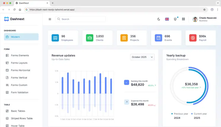
DashNext is purpose-built for Next.js and data visualization for any developer to build dashboards without compromise. It’s designed with those in mind who can’t do without a close integration with the Next.js ecosystem.
Tech Stack: Next.js, React, Tailwind, TypeScript
Last updated: May’2025
Key Features:
Single Minimalistic Dashboard.
30+ dashboard UI components.
50+ UI elements such as Accordion, Footer, DatePicker, Breadcrumbs, Pagination, and more.
Includes 5+ form and table variations.
Dark & Light Mode, and i18n (Internationalization) support.
NextAuth for secure admin section access.
Sales and customer metrics powered by ApexCharts.
Best for: Performance-focused, analytics-heavy admin dashboards built exclusively with Next-Auth.
MaterialM is a modern admin dashboard template inspired by Google’s Material Design 3 (M3) principles. It follows modern eCommerce design trends and works especially well with Python frameworks like Django. It comes with a fully responsive layout and a set of essential pre-built pages like dashboards, product listings, analytics views, and authentication screens.
Most starter kits are just templates, but NextKit is a developer-responsive and friendly admin panel template for modern e-commerce web apps. This is one of the fastest-performing templates with built-in backend functionalities, routing, and server-side rendering, so you can focus more on building rather than setup.
For teams focused on deeper metrics and reporting, you can also check out our analytics dashboard templates list for more building your own analytics tools.
7. Glass Admin
This is a pure HTML-based eCommerce dashboard template built for developers who want a lightweight, framework-free setup. It’s AI-customizable, allowing you to upload the source files to tools like Claude AI to quickly personalize colors, content, and layouts without rewriting core code. The glassmorphism UI gives it a modern, premium look while keeping the structure simple and maintainable.
Tech Stack: HTML, CSS, JavaScript
Last Updated: Jan’2026
Key Features:
2 dashboard variations: eCommerce and Analytics.
5 demo pages.
10+ reusable UI components.
Dark and Light mode support.
Basic sidebar layout included.
Login and Signup pages available.
Standard UI elements such as buttons, cards, tables, and basic charts for data visualization.
Best for: eCommerce and SaaS platforms that need a clean HTML dashboard with glassmorphism effects and quick customization.
AdminKit is a professional Web UI Kit compiled with Bootstrap 5. It comes with a huge library of more than 500 pre-designed web pages. It’s a fine pick if you have to monitor a high-volume store from one place, with 1.6k GitHub stars.
Tech Stack: HTML, Bootstrap 5, Sass
GitHub stars: 1600
Last updated: Apr’2024
Key Features:
Single dashboard layout.
15 demo pages, such as Settings, Profile, and Invoice.
10+ UI elements.
Authentication pages included.
Product galleries and listings.
Supports light and dark UI modes.
Advanced Chart.js visualizations.
Sales performance dashboards.
Best for: High-volume store monitoring and rapid dashboard development with Bootstrap 5.
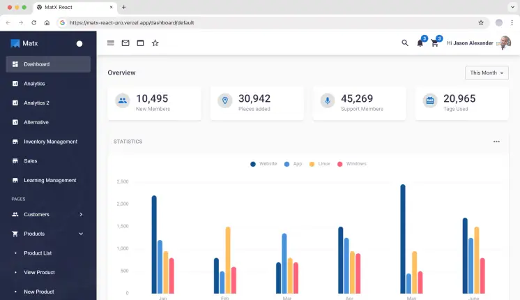
MatX is designed for logistics, stock management, and delivery dashboards. If moving physical items is what you do, then this classic Material UI template is your best bet, with 900+ GitHub stars.
Tech Stack: MUI, React
GitHub stars: 970
Last updated: Nov’2024
Key Features:
5 dashboard variations, including Analytics, Sales, and Inventory Management.
15 demo pages & 20+ UI elements.
Does not include Dark/Light mode or RTL support.
Authentication pages included, such as Login and Register.
Supports JWT, Auth0, and Firebase authentication.
Inventory management dashboards.
Shop with cart and checkout functionality.
Material UI–based components.
Optimized for fast setup.
Best for: Inventory, logistics, and delivery management dashboards built with Material UI.
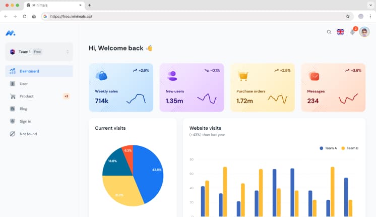
It is a popular React-based admin dashboard on Material UI (MUI). It includes basic eCommerce flows, and the free version serves as a lightweight starter kit with essential eCommerce components, with 1.8k GitHub stars.
Tech Stack: MUI, React, and Vite.js
GitHub stars: 2700
Last updated: Apr’2025
Key Features:
Single Minimalistic Dashboard.
5 demo pages.
10+ UI elements.
Authentication pages included, such as Login and Register.
Fully responsive design across mobile, tablet, and desktop devices.
Does not include support for light and dark modes.
Basic sidebar and top navigation layouts.
Access to standard UI elements, including buttons, cards, tables, and basic charts for data visualization.
Best for: Basic eCommerce dashboards built with Material UI.
1. Which eCommerce admin template supports multiple frameworks?
Modernize and MaterialM provide cross-framework support for React, Next.js, Vue, Django, Bootstrap, and Tailwind-based projects.
2. Do these dashboards support Laravel or headless backends?
Yes. They are API-driven UIs designed to integrate with Laravel, Django, Node.js, and other headless cms as well.
3. Are Next.js-optimized eCommerce dashboards beneficial?
Yes. Templates like DashNext and Spike follow Next.js best practices for routing, auth, and performance.
4. Why use a multi-framework dashboard template in long-term projects?
It reduces refactoring when switching frameworks and helps maintain a consistent admin UI across stacks.
Select the Perfect eCommerce Dashboard Template for Your Business
Ask yourself:
Does it integrate with my favorite framework?
Can it scale with my store?
Do the analytics and order workflow come included?
Is this going to save time on development down the road?
Conclusion
Whether you’re building an online store project from scratch or scaling an e-commerce platform, a well-built dashboard template can significantly reduce development effort and improve long-term maintainability.
Templates like Modernize, Spike, Tailwindadmin, and DashNext handle essentials such as authentication, analytics, and UI using modern stacks like React, Next.js, and Tailwind. From full eCommerce applications to custom admin panels and multi-framework dashboards, choosing a template that fits your stack and scales with your product helps you move faster while keeping your UI clean and manageable.
When you’re working with data, the right analytics dashboard template can change how you interpret and manage it. In today’s world, making smart decisions based on clear and actionable insights is more crucial than ever. If you’re working in business intelligence, marketing, or any data-driven field, these templates will help you showcase the data in a way that’s both easy to understand and impactful.
Why You Need the Best Analytics Dashboard Templates
As the world gets faster and faster, the importance of analytics and on-the-fly decision-making becomes increasingly critical. A well-designed analytics dashboard helps teams monitor SaaS metrics, website traffic, or product usage in one place – reducing manual reporting and enabling faster, data-backed decisions. As we approach the year 2026, the most important dashboard templates will be able to be tailored to the user in trend monitoring, KPI tracking, and actionable data reporting.
Checklist: Key Features of an Analytics Dashboard Template
Before we dive into our top 10+ free and premium templates, we’ve prepared a checklist for the analytics dashboard features that you will want to have:
Customization Options: Can developers reconfigure layouts, components, and data views without rewriting core logic?
Data Integration Readiness: Does it support real-time or async data sources (REST, GraphQL, WebSockets)?
Responsive Design: Does the dashboard adapt cleanly across desktop, tablet, and mobile views for on-the-go analytics monitoring?
Pre-made Widgets: Does it include essential widgets like line, bar, and pie charts, tables, and graphs to efficiently display your data?
Tech Stack Compatibility: Is the template built on production-ready frameworks (Next.js, React, Angular) suitable for scaling SaaS and analytics products?
Now you know what to keep an eye out for, let’s explore the best analytics dashboard templates for 2026.
Best Analytics Dashboard Templates
We reviewed each template based on developer experience, real-world analytics use cases (SaaS metrics, website analytics, product tracking), tech stack maturity, extensibility, and performance in production-grade dashboards.
Modernize Next.js Tailwind
Modernize Next.js Tailwind is a Next.js admin template integrated with Tailwind CSS that offers a sleek, modern, and minimalist design for developing modern web applications and dashboards faster.
MaterialM Tailwind React is super easy to customize. Having modern design trends makes it a great tool for creating scalable dashboards and analytics applications.
Tech Stack: React, Tailwind CSS, JavaScript, HTML
Key Features:
Fast & responsive UI is powered by React and Tailwind CSS
Component-driven structure ideal for scaling analytics views
Widgets are available for charts, tables, and graphs
Seamless integration with backend services and APIs
An Angular dashboard template designed for easy integration. It offers a set of reusable components and a highly customizable layout. Best for: Enterprise analytics dashboards with complex data flows.
This is a premium Next.js dashboard designed for richly SEO-optimized applications and webpages. Because of its great user experience, it is ideal for applications centered on analytics, CRM, and others.
MaterialPRO is a powerful Bootstrap admin template. It was designed to serve data-driven dashboards and analytical applications. Best for: Legacy systems or teams standardizing on Bootstrap-based analytics dashboards.
Tailwindadmin is a modern dark theme React admin template for very critical applications, which is inspired by Material Design created by Google. It is system-oriented with a polished style and is fully responsive for all devices, like desktop and mobile.
Tech Stack: React, Tailwind CSS, JavaScript, HTML
Key Features:
Built using React v19 & Tailwind CSS v4 , providing a lightning-fast UI
4+ Pre-built Demo Pages (Includes Horizontal, RTL, Mini Sidebar Versions)
Tools for visualizing data in the form of graphs and charts
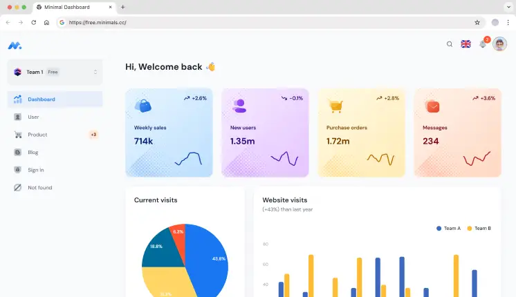
Minimal Dashboard is a sleek and modern template for an admin dashboard. While it is simple, it is also very powerful and provides an experience for designers who want a design with powerful functions, but simple and easy to use.
Tech Stack: React, Material UI, JavaScript, HTML
Key Features:
Minimal UI optimized for focused analytics and KPI monitoring
Flexibly Layout adjusts to your needs
Real-time data rendering
The user interface is simple in design for simple navigation
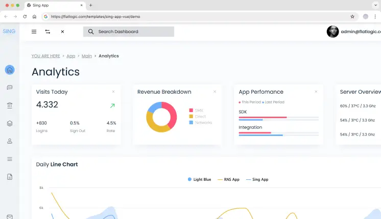
Sing App is a lightweight and simple admin template. It includes a complete set of pre-built UI components and powerful features to help you create dashboards faster.
Tech Stack: Vue.js, HTML, CSS, JavaScript
Key Features:
Built using Vue.js, which allows for rapid, fast & dynamic updates
Complete set of UI components, including tables, charts, and forms
Complete responsiveness to multiple screen sizes
Multiple pre-built design layouts and color themes
Vue-based structure suitable for custom analytics workflows
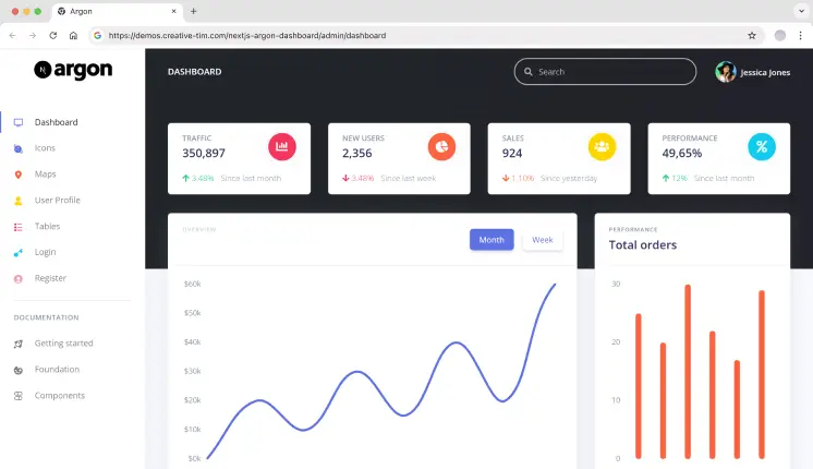
Argon is a free Next.js dashboard template focused on clean code, easy customization, and modern components with the ability to build fully-featured dashboards.
Tech Stack: Next.js, React, JavaScript, HTML, CSS
Key Features:
Build with Next.js for better performance and SEO
Beautiful design based on the Argon design system
Several ready-made pages and UI elements
Clean component structure for building analytics dashboards quickly
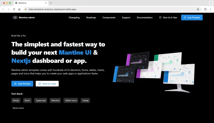
Mantine is a modern React library that provides a set of high-quality React components and hooks. This template is designed for developers who want to build dashboards with an elegant and flexible design quickly.
1. How do developers customize analytics dashboard templates?
These templates are highly modular for easy customization. You are free to change layouts, colors, and different widgets as needed. Most templates include documentation and modular components, making them suitable for custom analytics requirements.
2. Can these templates handle real-world analytics data?
Yes. These templates are designed to handle real-time and large datasets commonly used in SaaS analytics, website tracking, and internal reporting systems.
3. Can these templates integrate with APIs and analytics services?
Yes, these templates are designed for simple interfacing with your backend systems. Whether you are using a REST API, GraphQL, analytics services, or data pipelines, the templates are flexible enough to be integrated without any hassle.
Final Thoughts
Choosing the right analytics dashboard template depends on your technical stack and the type of analytics you’re building.
Modernize Next.js Tailwind and MaterialM Tailwind React are well-suited for teams building SaaS analytics or website analytics dashboards that require fast iteration and a modern Tailwind-based workflow.
Spike Next.js stands out for developers who need strong SEO, server-side rendering, and production-ready performance for public-facing analytics pages.
For Angular-based teams working on enterprise-scale analytics with complex data flows, MatDash Angular offers a structured and scalable foundation.
Each template in this list was selected based on real-world analytics use cases, framework maturity, and the ability to scale as data complexity grows.
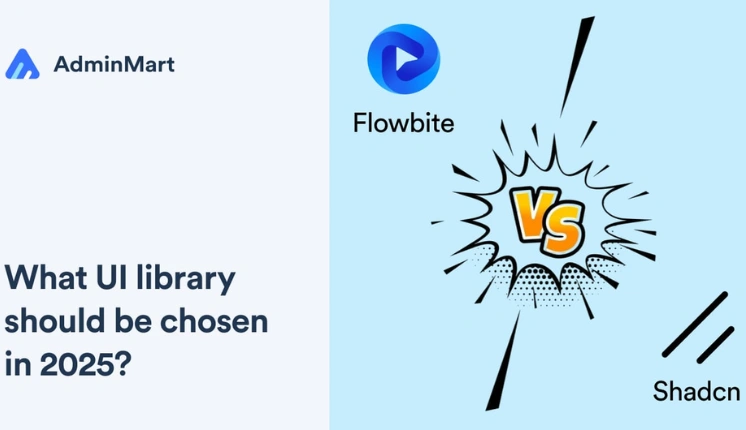
Building a modern web app’s UI from scratch is like assembling IKEA furniture without the manual. You’ll waste hours tweaking buttons, debugging dropdowns, and crying over inconsistent spacing. That’s where UI libraries like Flowbite React and Shadcn come in—they hand you the tools to build faster. But which one is right for your project?
In this guide, we’ll dissect both libraries, compare their strengths, and show you how pre-built admin templates can turn months of work into days.
What is Flowbite React?
Flowbite React is an open-source UI component library built for React that’s powered by Tailwind CSS. It’s designed to get you up and running fast with a collection of pre-styled, accessible components—from dropdowns and modals to slick forms and more.
Key Features:
Pre-Built Components: 50+ elements styled with Tailwind’s utility classes.
Dark Mode Toggle: Switch themes with a single line of code.
Interactive Elements: Dropdowns, tooltips, and datepickers with built-in JavaScript.
Community-Driven: Open-source updates and third-party plugins.
Code Example: Flowbite Button
import { Button } from 'flowbite-react';
// A fully styled button with hover effects
<Button color="blue" pill={true}>
  Click Me
</Button>
Pros
Speedy Setup: Super-fast integration that helps you build prototypes and MVPs quickly.
Great Documentation: Comprehensive guides and an active community make troubleshooting issues easier.
Responsive Design: Components look fantastic across all devices, with built-in dark mode support.
Consistent Styling: Pre-designed elements ensure a uniform look throughout your application.
Accessibility: Components are built with accessibility in mind, reducing development headaches later.
Cons
Customization Limits: The pre-styled approach might constrain developers who want a radically unique look.
Smaller Ecosystem: Fewer third-party add-ons compared to some other libraries.
Opinionated Design: May not easily fit projects that require a completely custom aesthetic.
Dependency on Tailwind: If you’re not familiar with Tailwind CSS, there might be a learning curve.
When to Choose Flowbite React
Flowbite React is ideal if you need to build something quickly without reinventing the wheel. It works best for:
Rapid Prototyping & MVPs: Get a working model up in no time with minimal setup.
Startups & Small Teams: If you’re short on design resources, the pre-styled components ensure a professional look without hiring a UI designer.
Projects Favoring Consistency: When you need a uniform design language across your application, Flowbite React’s opinionated styling is a big plus.
Tailwind Enthusiasts: If your project already leverages Tailwind CSS, Flowbite React integrates seamlessly, reducing the time spent on custom styling.
Imagine having a head start on your next project with a template that not only looks stunning but also works like a charm. The MaterialM Template is designed with Flowbite React to give you a smooth, plug-and-play experience. This template comes loaded with everything you need—from a fully responsive layout to a best collection of pre-built components, it’s crafted to save you hours of development time.
Global dark/light mode toggling with zero CSS overrides
TypeScript-ready codebase for enterprise scalability
6 demo variations: Main Dashboard, Dark Mode Edition, RTL support, Horizontal & Mini Sidebar layouts
Integration with modern tech: Shadcn & Headless UI, Firebase Auth, SWR data fetching, and i18n React
Real-world application templates for eCommerce, Healthcare, and SaaS
Optimized, pixel-perfect responsive layouts
1-year updates and support with priority bug fixes and React 18+ compatibility
MIT License for risk-free use in client projects or internal tools.
What is Shadcn UI?
Shadcn takes a different approach by offering unstyled, headless components. This means you get a bare-bones foundation, leaving all the creative control in your hands. It’s perfect if you want to build something truly one-of-a-kind.
Key Features:
Zero Default Styling: Style components with CSS, Tailwind, or CSS-in-JS.
Framework-Agnostic: Works with React, Vue, Svelte, or vanilla JS.
TypeScript Support: Built for type-safe enterprise apps.
Accessibility-First: ARIA labels, keyboard navigation, and screen reader support.
Code Example: Shadcn Button
import { Button } from '@shadcn/ui';
// A barebones button – you style it yourself
<Button className="bg-brand-blue text-white px-4 py-2 rounded-lg">
  Click Me
</Button>
Pros
Ultimate Customization: Offers the freedom to design every component exactly how you envision it.
Lightweight Performance: With minimal bloat, your application can load quickly and run smoothly.
Flexibility: The unstyled approach means you can integrate your own design system without fighting against preset styles.
Clean Slate: Perfect for projects where you want full control over the user interface.
Framework Agnostic: While popular with React, its design principles can be applied across multiple frameworks.
Cons
Extra Setup Required: You need to write your own styles, which might extend development time.
Steeper Learning Curve: Requires a stronger grasp of CSS and design principles to fully leverage its flexibility.
Less Out-of-the-Box: You start with a blank canvas, which can be daunting if you’re looking for a ready-made look.
Potential Inconsistencies: Without pre-defined styling, maintaining uniformity across components depends entirely on your implementation.
When to Choose Shadcn UI?
Shadcn shines when your project demands a bespoke design that aligns perfectly with your brand identity. Consider it if:
Custom Design is a Priority: Ideal for enterprise-level applications where unique branding is non-negotiable.
You Have a Design-Savvy Team: If your team is comfortable with CSS and enjoys crafting custom styles, Shadcn gives you all the flexibility you need.
Performance is Key: Its lean, unstyled components ensure that you can build fast-loading, efficient applications.
You Need a Blank Slate: If you want a completely customizable foundation without any pre-imposed design, Shadcn is your best friend.
Looking for a developer-friendly, premium Tailwind CSS template packed with powerful pages and components ? Modernize has you covered. Designed by top-notch designers and built with industry-standard code, it’s your go-to choice for creating scalable web applications hassle-free.
Let’s be honest: no one likes reinventing the wheel. Pre-built templates can:
Save You Time: Skip the boring setup and jump right into building features.
Ensure Quality: All components are tested to work well together, reducing bugs and compatibility issues.
Boost Productivity: Focus on what really matters instead of fighting with boilerplate code.
Wrapping It Up
Choosing between Flowbite React and Shadcn really comes down to your project’s specific needs. If you value speed and a ready-to-use design, Flowbite React is a fantastic option. But if you need complete creative control and are ready to put in a bit more work, Shadcn will let you build something truly unique.
And remember, you don’t have to choose between them entirely. With AdminMart’s React Templates & WrapPixel’s Shadcn Dashboards, you can enjoy the benefits of both worlds. These Admin templates are designed to help you kickstart your project, save time, and ensure you deliver a top-notch user experience.
Building an e-commerce store from scratch can be overwhelming, especially if you’re new to frontend development. But don’t worry, ShadCN-based E-Commerce templates are here to make it easier for developers to launch modern, stylish, and functional Online stores quickly.
These templates come pre-built with essential features like product pages, checkout systems, user authentication, and modern UI components. With React, Next.js, Tailwind CSS, and ShadCN UI, they offer a powerful and flexible foundation for your online store.
Build an Effortless E-Commerce Online Store with Top ShadCN UI Templates
In this article, I’ve handpicked some of the Best ShadCN e-commerce templates that will help you launch your store quickly and efficiently.
Whether you’re a beginner or an experienced developer, there’s something for you here. Let’s dive in! 🚀
MaterialM ShadCN Theme
MaterialM is a great choice for developers who want a Google Material Design-based admin panel for their e-commerce store. It follows Google’s Material Design 3 guidelines, ensuring a clean, modern, and consistent UI.
Why Choose MaterialM Shadcn Template?
✅ Easiest E-commerce Features: Includes a shop page, product details, checkout, filters, and more. ✅ Additional Features: Comes with a blog, invoice section, and user profiles. ✅ Modern UI & Customization: Built with Material Design 3 for a visually pleasing interface.
Tech Stack & Features MaterialM Shadcn Theme:
Built with React – Optimized performance, SEO-friendly, and supports server-side rendering.
Supercharged by ShadCN & Headless UI – Ensures smooth and accessible UI interactions.
Flowbite React – Offers pre-built UI components for faster development.
Headless UI – Ensures smooth and accessible interactions.
Perfect For: Developers looking for a clean and fully functional e-commerce template with built-in pages.
Matdash is a lightweight and fast e-commerce admin template made for Next.js & React projects. With its clean code structure and optimized performance, it’s perfect for modern online stores.
Why Choose Matdash React Shadcn Template?
✅ Built for React projects with ShadCN UI integration. ✅ All essential e-commerce components for a complete online store setup. ✅ Pre-Built Components – All the necessary UI elements for an online store. ✅ API-Ready – Uses SWR for real-time data fetching. ✅ React & Next.js Versions – Pick the one that fits your project.
Tech Stack & Features Matdash React Shadcn Theme:
Built with React & TypeScript – Optimized performance, SEO-friendly, and supports server-side rendering.
ShadCN UI & Headless UI – Smooth, accessible user experience.
Firebase & SWR integration – Backend-ready.
Tailwind CSS for – Stylish, easy-to-use design.
Perfect For: Frontend developers who want a ready-to-go React template with minimal setup.
Matdash Next.js is a high-performance, developer-friendly e-commerce template built for Next.js. It comes with essential admin panel components, making it a perfect choice for managing an online store efficiently.
Why Choose Matdash NextJs Shadcn Template?
✅ Optimized for Next.js – Great for SSR (Server-Side Rendering) & SEO. ✅ Multipurpose Dashboard – Suitable for e-commerce & admin panels. ✅ Comes in React & Next.js Versions – Choose what suits your needs best.
Tech Stack & Features Matdash NextJs Shadcn Theme:
Next.js v15.0.1 & TypeScript v5 – High performance and scalability.
Modernize is one of the most modern and stylish dashboard templates for e-commerce. It provides a sleek UI with both light and dark mode support, making it ideal for creating visually appealing admin panels.
Why Choose Modernize Shadcn Template?
✅ Light & Dark mode support – Works for all user preferences. ✅ E-commerce Ready – Includes shop, product pages, checkout, and more. ✅ Pre-built landing pages: Blog, About us, Homepages. ✅ Highly customizable – Ideal for developers looking for a flexible admin dashboard.
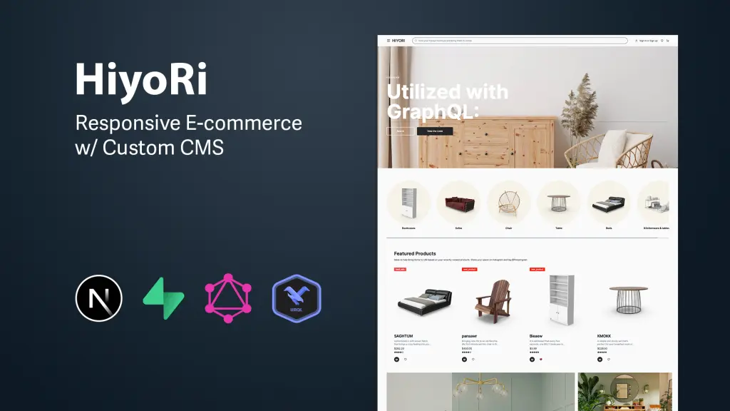
Hiyori is an advanced e-commerce platform that integrates a custom Content Management System (CMS), aimed at delivering a superior online shopping experience. It leverages modern web technologies to provide a scalable and feature-rich e-commerce solution.
Why Choose Hiyori Shadcn Template?
✅ Advanced E-commerce Platform – Comes with a built-in CMS. ✅ Uses Next.js 14 & GraphQL – Perfect for complex projects. ✅ Optimized for performance with modern development practices.
Shopco is an open-source project that converts Figma designs of e-commerce websites into fully responsive front-end applications. Built with modern web technologies, it’s perfect for developers looking for a scalable and maintainable e-commerce solution.
Why Choose Shopco Shadcn Template?
✅ Figma designs a fully functional e-commerce store ✅ SEO & Performance Optimized – Ranks better on search engines. ✅ Built for high performance
Tech Stack & Features Shopco Shadcn Theme:
Next.js 14 & TypeScript – High-speed performance.
ShadCN UI & Tailwind CSS – Beautifully designed UI.
Redux – Smooth state management.
Framer Motion – Elegant animations.
Perfect For: Developers who want a fast, responsive, and modern Next.js e-commerce template with Figma design conversion.
If you’re a front-end developer looking for a fast and efficient way to build an online store, these ShadCN e-commerce templates will save you tons of time. You can also pair them with an AI app builder to accelerate development, automate setup tasks, and launch your store even faster.
Whether you prefer React or Next.js, each of these templates offers pre-built UI components, modern designs, and essential e-commerce features.
These ShadCN E-Commerce Templates offer everything you need to build a powerful Admin Dashboard for an online store. Whether you’re a beginner or an experienced developer, there’s a template that suits your needs.
🚀 Our Top Picks:
Best for Beginners:MaterialM ShadCN – Easy setup & full e-commerce pages.
Best for Advanced Developers:Hiyori – CMS integration & GraphQL.
Best for Speed & SEO:Matdash Next.js – Next.js-powered performance.
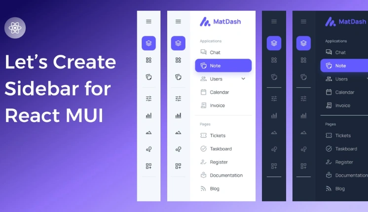
In modern web development, a well-designed React sidebar can greatly enhance user experience by providing easy navigation and access to essential features. As we are already in 2025, the role of sidebars has become increasingly crucial for intuitive user interfaces.
Introduction to the react mui sidebar NPM package
The React MUI sidebar, powered by Material-UI, stands out as a leading React NPM package designed to streamline the creation of responsive and highly customizable sidebars. In this article, we will explore the key aspects of react-mui-sidebar and how it elevates the sidebar experience in React applications.
Understanding MUI Sidebar
What is MUI (Material-UI)?
Material UI is a widely adopted React UI framework that brings Google’s Material Design principles to React applications. MUI Sidebar leverages the strengths of Material-UI, providing a seamless integration for creating visually appealing and responsive sidebars.
Features of React Sidebar
Responsive Design: MUI Sidebar ensures a consistent and adaptive layout across various screen sizes, catering to the increasing demand for mobile-friendly interfaces.
Customization Options: Developers can easily change the appearance of the sidebar to match the overall design of their application, allowing for a cohesive and branded look.
Integration with React: MUI Sidebar seamlessly integrates with React, offering a familiar and efficient development experience.
User-Friendly: MUI Sidebar is designed with simplicity in mind, making it easy for developers to incorporate into their projects. With intuitive documentation, developers can quickly grasp and implement the sidebar functionality.
Icons Support: The sidebar comes with built-in support for icons, allowing developers to enhance the visual appeal and usability of their application. Developers can use any icon library and provide the icon component.
Menu and Submenu Support: It provides a hierarchical structure with support for both main menus and nested submenus. This feature enables developers to organize and present complex navigation structures clearly and intuitively.
Smooth Transitions: The sidebar incorporates smooth transition effects, enhancing the overall user experience by providing a visually pleasing navigation flow. Animations are thoughtfully implemented to avoid any jarring effects during sidebar interactions.
Why choose react mui sidebar?
Optimized Performance
react-mui-sidebar is designed and configured for high performance, ensuring smooth and responsive user interactions. This is crucial for applications, especially those with complex or intricate user interfaces, where performance issues can negatively impact the user experience.
Community Strength
The mention of a vibrant Material-UI community implies that MUI Sidebar benefits from a large and active user base. This is advantageous for users because it means there’s a wealth of resources, tutorials, and assistance available. A strong community can contribute to the growth of the framework, provide solutions to common issues, and foster collaboration among developers.
Reliable Maintenance
Highlighting consistent updates and proactive maintenance indicates that the react-mui-sidebar is actively supported. Regular updates often include bug fixes, security patches, and new features, ensuring that the framework remains current and adaptable to evolving needs. This is particularly important for long-term projects, as it signifies a commitment to the ongoing improvement and support of the framework.
In this tutorial, we will walk you through the process of installing and setting up react-mui-sidebar in a Next.js application. You’ll learn how to integrate the sidebar, add a logo, create menus, and use links.
Step 1: Installation Process
To begin, you’ll need to install the react-mui-sidebar package into your Next.js project. You can do this by using either npm or yarn.
Using npm:
npm install react-mui-sidebar
Using yarn:
yarn add react-mui-sidebar
This will add react-mui-sidebar and its dependencies to your project.
Step 2: Importing the MUI Sidebar Component
Once the package is installed, you can import the necessary components from react-mui-sidebar into your project. These components will help you create the sidebar and add various menu items.
import { Sidebar, Menu, MenuItem, Submenu, Logo } from "react-mui-sidebar";
These components will allow you to customize the sidebar with menus, submenus, and even a logo.
Step 3: Initializing the Sidebar
Now we’ll set up the Sidebar component in your application. You can set the width of the sidebar using the width prop. Here’s a simple example:
<sidebar width={"270px"}>

  {/* Sidebar Content Goes Here */}

</sidebar>
This initializes the sidebar with a width of 270px. You can adjust this width based on your design requirements.
Step 4: Adding a Logo to the Sidebar
You can add a logo inside the sidebar by using the Logo component. To do so, you can provide a src URL or use the img prop to link to a CDN logo image. Here’s how you can include a logo:
In this example, we’ve added a logo from a CDN and set the text “AdminMart” as the name of the application.
Step 5: Creating a Menu Inside the Sidebar
Now let’s create a menu inside the sidebar using the Menu component. You can specify a submenu heading using the subHeading prop. Inside the Menu, you can add MenuItem components for each item.
You can also provide a link prop to the MenuItem to turn the item into a clickable link.
The first MenuItem has a link prop, so clicking it will navigate to the homepage (/).
The second and third MenuItem components are simple text items without links.
The badge=”true” prop can be used to indicate a badge or notification on the MenuItem, though you can customize this feature according to your needs.
Step 6: Adding Submenus (Optional)
To add submenus inside the main menu, use the Submenu component. The Submenu can be nested inside the Menu component and contains its own set of MenuItems.
A submenu under the “Marketing” heading is added inside the “SERVICES” menu.
The submenu contains two MenuItems with links to different service pages.
Conclusion on NPM Package
You have now successfully integrated a fully functional sidebar in your Next.js application using react-mui-sidebar. You can further customize the sidebar by:
Modifying the width and design.
Adding more submenus, menu items, or icons.
Using links to navigate between pages.
This setup provides a flexible, responsive, and easy-to-use sidebar, which is perfect for most web applications.
Note: Please be aware that we utilized react-icons to construct this sidebar. Feel free to choose an alternative library or use different icons based on your specific requirements.
Are you searching for an exceptionally versatile and developer-friendly premium React admin template tailored for e-commerce? Look no further! Introducing our Modernize E-commerce Admin Dashboard, a feature-rich solution designed with industry standards and best practices in mind. This template offers a detailed e-commerce page, ensuring a seamless start to your e-commerce venture.
Experience the power of a customizable and attractive Material UI React admin template, complete with an admin dashboard for efficient management. Elevate your e-commerce platform with Modernize!
If you’re into web development, you know how important it is to do things the right way. That’s where Next.js comes in – a cool framework for making awesome web applications. Whether you’re a coding pro or just starting, this guide will help you learn the ropes of making your Next.js projects top-notch.
We’re here to talk about stuff like making your sites load faster, getting them noticed by search engines, and building them so they look and work great on any device. We’ve got real tips from real experts, and we’ll explain everything in a way that makes sense, even if you’re not a tech wizard.
Whether you’re starting from scratch or fixing up something you already made, our guide will give you easy steps, examples you can relate to, and reasons why each tip matters. Let’s dive into the world of Next.js and learn how to make your Next.js web projects incredible!
NextJS Best Practices for Excellence
Next.js is a powerful framework that enables developers to build performant and scalable web applications, making it an excellent choice for custom web application development. To make the most out of Next.js, it’s essential to follow best practices that ensure code quality, maintainability, and optimal performance. Here are some Next.js best practices to help you achieve excellence in your projects:
Next.js Lazy Loading
Next.js has a neat technique called lazy loading. It means that instead of bringing everything onto the webpage all at once, things only show up when you really need them. This helps the webpage use less data and load faster.
Next.js makes this happen using something called dynamic imports. Think of it like getting deliveries – you only ask for a package when you’re ready to use it, not all of them at once. By doing this, you can split your website’s code into smaller parts. Each part only shows up when it’s actually required. This makes your webpage start up faster because it doesn’t have to load everything from the beginning. It’s like setting up your webpage piece by piece instead of all at the same time.
Next.js code splitting with next/dynamic
Next.js code splitting is a technique used to split the JavaScript code of a Next.js application into smaller chunks, allowing the browser to load only the necessary code for each page or component.
Next.js uses automatic code splitting by default. When you build your Next.js application, it analyzes your pages and components and generates separate bundles for each one. These bundles are then loaded on demand as the user navigates through the application.
next/dynamic is a feature offered by Next.js that allows you to import components dynamically. This is useful when you want to load a component only when it’s needed, such as when the user scrolls to a certain point on the page. To use next/dynamic, follow these steps:
Import the dynamic function from next/dynamic in your Next.js component file: import dynamic from 'next/dynamic
Wrap the component you want to dynamically load with the dynamic function:
Render the DynamicComponent in your component’s JSX: <DynamicComponent />
That’s it! Now, the YourComponent will be lazy-loaded and rendered only when it’s needed.
You can also pass additional configuration options to the dynamic function. For example, you can specify a loading component to be shown while the DynamicComponent is being loaded:
Additionally, you can configure other options like SSR (server-side rendering), SSG (static site generation), and noSsr (disable server-side rendering).
Lazy loading of Images
Next.js provides a component called Image that makes it easy to implement lazy loading of images. The Image component automatically optimizes and lazy loads images based on the viewport of the user’s device.
To use the Image component, follow these steps:
Import the Image component in your Next.js page or component file: import Image from 'next/image';
Replace the img tag with the Image component and specify the src and alt attributes: <Image src="/path/to/image.jpg" alt="Description of the image" />
You can specify the width and height attributes of the image. This helps Next.js optimize the image and generate multiple sizes for responsive layouts: <Image src="/path/to/image.jpg" alt="Description of the image" width={500} height={300} />
That’s it! Next.js will take care of lazy loading the image and optimizing it for performance. The Image component also provides additional features like automatic responsive layouts, priority loading, and placeholder images. If you want to learn about chart libraries using React with Next. You should go through the React chart libraries guide that we’ve published previously.
Using built-in Components
In Next.js, several built-in components provide useful functionality out of the box. Here are some commonly used ones, along with their use cases and code examples
Image Component
The Image component allows optimized image loading and lazy loading, improving performance and user experience. It automatically optimizes images based on the device and network conditions.
The Link component is used for client-side navigation in Next.js applications. It ensures that navigation between pages is faster by pre-fetching the necessary data.
import Link from 'next/link';
const MyComponent = () => (
  <div>
    <Link href="/about">
      About
    </Link>
  </div>
);
ScriptComponent
The Script component is used to load external scripts into your Next.js application. It ensures that the scripts are loaded asynchronously and won’t block the rendering of the page.
This script will load and execute when any route in your application is accessed. Next.js will ensure the script will only load once, even if a user navigates between multiple pages.
Head Component
The Head component allows you to modify the <head> tag of the document. It is useful for adding meta tags, managing the document title, and including external stylesheets or scripts.
import Head from 'next/head'
function IndexPage() {
  return (
    <div>
      <Head>
        <title>My page title</title>
      </Head>
      <p>Hello world!</p>
    </div>
  )
}
export default IndexPage
To avoid duplicate tags in your head, you can use the key property, which will make sure the tag is only rendered once, as in the following example:
import Head from 'next/head'
function IndexPage() {
  return (
    <div>
      <Head>
        <title>My page title</title>
        <meta property="og:title" content="My page title" key="title" />
      </Head>
      <Head>
        <meta property="og:title" content="My new title" key="title" />
      </Head>
      <p>Hello world!</p>
    </div>
  )
}
export default IndexPage
These built-in components in Next.js provide convenient ways to handle common tasks and improve the performance and user experience of your application.
Do you need a highly customizable and developer-friendly premium Next.js admin template packed with numerous features? Modernize Next.js Admin Template has everything you need. This Next.js-based admin template is designed in accordance with industry standards and best practices to provide you with a unique yet attractive admin template. You can view the live demo here.
Using the Modernize Next.js admin template, you will be able to create your website or web application without any hassle. Its high scalability, speedy development, and ease of use make it the best choice in the Next.js framework. It provides every convenience and flexibility that you can imagine, making it one of the best Next.js admin templates available in the premium Next.js category. Some examples of the apps that you can create using the Modernize Next Js admin dashboard template include:
CRM systems
Analytical apps
SaaS platforms
Educational apps
Health & Fitness apps
E-commerce backend
Banking & Finance apps
Use CSS Modules
CSS Modules are a technique for localizing the scope of CSS class names in your web applications. They provide a way to encapsulate styles and prevent them from conflicting with each other when building complex user interfaces. CSS Modules are particularly useful in projects where multiple developers are working on different parts of the application, as they reduce the risk of inadvertently affecting styles in other components.
Here’s a Next.js example of how to use CSS Modules:
Open or create styles.module.css and add some CSS code:
2. Create a new React component that uses the CSS Module:
import styles from '../styles/styles.module.css';
export default function Home() {
  return (
    <div>
      <button className={styles.button}>Click me</button>
    </div>
  );
}
In this example, the styles.button class is imported from the styles.module.css file using the styles object. This allows you to use the CSS classes defined in the module as properties of the styles object. This approach ensures that the class names are scoped to the component and won’t clash with global styles.
Caching Data in Next.js
Caching data is an effective technique to improve the performance and user experience of Next.js applications. By storing frequently accessed data in a cache, subsequent requests can be served faster, reducing the load on the server and improving overall performance. Next.js provides various methods and strategies to implement caching in your application.
Client-Side Caching
Next.js utilizes client-side caching to store and reuse data fetched from APIs or server-side rendering. This caching mechanism reduces the need to make repetitive API calls, resulting in faster page rendering and improved user experience.
To implement client-side caching in Next.js, you can take advantage of the SWR library. SWR is a powerful data fetching library that provides caching, revalidation, and deduplication of requests. Here’s the Next.js example of how to use SWR for caching data:
import useSWR from 'swr';
const fetcher = (url) => fetch(url).then((res) => res.json());
function MyComponent() {
  const { data } = useSWR('/api/data', fetcher);
  if (!data) {
    return <div>Loading...</div>;
  }
  return (
    <div>
      {data.map((item) => (
        <div key={item.id}>{item.name}</div>
      ))}
    </div>
  );
In the example above, the useSWR hook is used to fetch data from the /api/data endpoint. The fetcher function is responsible for performing the actual API call. The fetched data is automatically cached by SWR, and subsequent renders of the component will reuse the cached data until it expires.
Server-Side Caching
By default, Next.js automatically caches the returned values of fetch in the Data Cache on the server. This means that the data can be fetched at build time or request time, cached, and reused on each data request.
// 'force-cache' is the default, and can be omitted
fetch('https://...', { cache: 'force-cache' })
fetch requests that use the POST method are also automatically cached. Unless it’s inside a Route Handler that uses the POST method, then it will not be cached.
If you are using Next.js 12 or an older version, then here’s an example of how to use getServerSideProps for server-side caching:
// pages/index.js
import React from 'react';
function HomePage({ data }) {
  return (
    <div>
      <h1>Server Side Caching Example</h1>
      <ul>
        {data.map((item) => (
          <li key={item.id}>{item.title}</li>
        ))}
      </ul>
    </div>
  );
}
export async function getServerSideProps() {
  // Fetch data from an API or any other source
  const response = await fetch('https://api.example.com/data');
  const data = await response.json();
  // Cache the data for 10 seconds
  const maxAge = 10;
  const cacheControl = `public, max-age=${maxAge}`;
  return {
    props: {
      data,
    },
    // Set the cache control header
    headers: {
      'Cache-Control': cacheControl,
    },
  };
}
export default HomePage;
In the above example, the getServerSideProps function fetches data from an API and sets the Cache-Control header to cache the data for 10 seconds. The fetched data is then passed as props to the HomePage component.
Server-side caching is just one approach to improve performance in Next.js applications. You can also use client-side caching libraries like SWR to cache data on the client side.
Use Route Handlers
Route Handlers allow you to create custom request handlers for a given route using the Web Request and Response APIs.
Route Handlers are only available inside the app directory. They are the equivalent of API Routes inside the pages directory meaning you do not need to use API Routes and Route Handlers together.
// app/items/route.ts
import { NextResponse } from 'next/server'
export async function GET() {
  const res = await fetch('https://data.mongodb-api.com/...', {
    headers: {
      'Content-Type': 'application/json',
      'API-Key': process.env.DATA_API_KEY,
    },
  })
  const data = await res.json()
  return NextResponse.json({ data })
}
// POST Request
export async function POST() {
  const res = await fetch('https://data.mongodb-api.com/...', {
    method: 'POST',
    headers: {
      'Content-Type': 'application/json',
      'API-Key': process.env.DATA_API_KEY,
    },
    body: JSON.stringify({ time: new Date().toISOString() }),
  })
  const data = await res.json()
  return NextResponse.json(data)
}
Use multiple data rendering modes
Data fetching and rendering data on the webpage are a core part of any application. This page goes through how you can fetch, cache, and revalidate data in React and Next.js.
Next.js extends the native fetch Web API to allow you to configure the caching and revalidating behavior for each fetch request on the server. React extends fetch to automatically memoize fetch requests while rendering a React component tree.
async function getData() {
  const res = await fetch('https://api.example.com/...')
  // The return value is *not* serialized
  // You can return Date, Map, Set, etc.
  if (!res.ok) {
    // This will activate the closest `error.js` Error Boundary
    throw new Error('Failed to fetch data')
  }
  return res.json()
}
export default async function Page() {
  const data = await getData()
  return <main></main>
Revalidating Data
Revalidation is the process of purging the Data Cache and re-fetching the latest data. This is useful when your data changes and you want to ensure you show the latest information.
Alternatively, to revalidate all fetch requests in a route segment, you can use the Segment Config Options.
export const revalidate = 3600 // revalidate at most every hour
Fetching data on the Server with third-party libraries
If you’re using a third-party library that doesn’t support or expose fetch (for example, a database, CMS, or ORM client), You can configure the caching and revalidating behavior of those requests using the Route Segment Config Option and React’s cache function.
import { cache } from 'react'
export const revalidate = 3600 // revalidate the data at most every hour
export const getItem = cache(async (id: string) => {
  const item = await db.item.findUnique({ id })
  return item
Fetching Data on the Client with Route Handlers
If you need to fetch data in a client component, you can call a Route Handler from the client. Route Handlers execute on the server and return the data to the client. This is useful when you don’t want to expose sensitive information to the client, such as API tokens.
Route Handlers allow you to create custom request handlers for a given route using the Web Request and Response APIs.
// app/data/route.ts
import { NextResponse } from 'next/server'
export async function GET() {
  const res = await fetch('https://data.mongodb-api.com/...', {
    headers: {
      'Content-Type': 'application/json',
      'API-Key': process.env.DATA_API_KEY,
    },
  })
  const data = await res.json()
  return NextResponse.json({ data })
}
Fetching Data on the Client with third-party libraries
You can also fetch data on the client using a third-party library such as SWR or React Query. These libraries provide their own APIs for memoizing requests, caching, revalidating, and mutating data. Here is an example of a SWR request:
import useSWR from 'swr'
function Profile() {
  const { data, error, isLoading } = useSWR('/api/user', fetcher)
  if (error) return <div>failed to load</div>
  if (isLoading) return <div>loading...</div>
  return <div>hello {data.name}!</div>
TypeScript Support
One of the best practices when working with Next.js projects is to leverage TypeScript for an enhanced development experience and improved code quality. TypeScript is a statically-typed superset of JavaScript that adds type annotations to the language. It provides several benefits that make it a best practice for Next.js projects.
Type Safety
TypeScript introduces static typing, allowing developers to catch errors during development rather than at runtime. By specifying types for variables, function parameters, and return values, TypeScript helps identify potential bugs and provides better code completion and refactoring tools. This reduces the likelihood of runtime errors, leading to more reliable and maintainable code.
// Example: TypeScript Type Annotation
function greet(name: string): string {
  return `Hello, ${name}!`;
}
Better Tooling and IntelliSense
TypeScript integrates well with modern development tools and IDEs such as Visual Studio Code. These tools provide powerful features like IntelliSense, autocompletion, and code navigation, making it easier to write, refactor, and maintain code. TypeScript’s type system enables tools to provide accurate suggestions and catch potential errors, resulting in a more productive development experience.
Improved Collaboration
In a collaborative project, TypeScript can greatly enhance the development process. With type annotations, developers can understand the structure and expected behavior of functions and objects without having to dive into the implementation details. This improves communication between team members and reduces the chances of misinterpreting code.
Ecosystem and Community Support
TypeScript has gained significant popularity and has a thriving ecosystem and community. Many popular libraries and frameworks have official TypeScript support, including Next.js. This means that when using TypeScript in Next.js projects, you can take advantage of type definitions and improved interoperability with these libraries. Additionally, the TypeScript community provides helpful resources, tutorials, and support, making it easier to learn and troubleshoot. If you want to learn the best tools for the React ecosystem. I’ll suggest reading the blog that we’ve published on the React ecosystem.
Enhance SEO in Next.js
To enhance SEO in a Next.js app, one effective approach is to use the next-seo package. This package provides a set of components and utilities that make it easy to add meta tags, structured data, and other SEO-related elements to your Next.js application.
To implement meta tags using next-seo, you can make use of the NextSeo component provided by the package. This component allows you to define meta tags such as the title, description, and canonical URL for each page of your application.
Here’s an example of how you can implement meta tags using next-seo:
import { NextSeo } from 'next-seo';
function MyPage() {
  return (
    <>
      <NextSeo
        title="My Page"
        description="This is my awesome page"
        canonical="https://www.example.com/my-page"
      />
      {/* Rest of your page content */}
    </>
  );
}
export default MyPage;
By implementing these SEO techniques, the visibility of your Next.js app in search engine results can be improved, attracting more organic traffic and improving the overall discoverability of your application.
Benefits of better SEO
Visibility
SEO helps your website appear higher in search engine results. When users search for topics related to your website, better SEO increases the chances of your site showing up, leading to more visibility and organic traffic.
Organic Traffic
Search engines like Google are major sources of traffic. Improving your SEO means you’re more likely to attract visitors who are actively looking for the content or products your website offers.
Credibility
High-ranking websites often appear more credible to users. People tend to trust search engine results, so a strong presence in these results can positively impact your site’s credibility and reputation.
User Experience
Many SEO practices focus on improving the structure and usability of your website. This benefits not only search engines but also your visitors. A well-optimized site is easier to navigate and provides a better user experience.
Long-Term Benefits
SEO is an investment that can pay off over time. While it might take time to see significant results, the efforts you put into optimizing your site can have lasting benefits.
Cost-Effective
Organic traffic from search engines is essentially free. While you might invest in SEO strategies, the long-term benefits often outweigh the initial costs, making it a cost-effective marketing approach.
Ad Blockers
Many users employ ad blockers or simply ignore online ads. Having a strong organic presence through effective SEO ensures that your website still gets seen even when users avoid ads.
Analytics and Insights
Properly implemented SEO often comes with analytics tools that provide insights into your website’s performance and user behavior. This data can help you refine your strategies and improve your site further.
Remove unused dependencies & Code
The act of removing unused dependencies and files within a software project holds substantial importance for a variety of reasons.
It significantly impacts the efficiency and performance of the application. Unused dependencies and files can bloat the application’s package size, thereby slowing down its loading times. By eliminating these extraneous elements, the codebase becomes more streamlined, resulting in quicker load times and enhanced overall performance.
Unused dependencies consume storage space within the project’s structure, and while this might seem negligible in smaller projects, it can accumulate and pose challenges in larger endeavors. Effective resource management is essential for maintaining a well-organized and clutter-free codebase.
Security also comes into play. Each dependency introduced into a project carries potential security risks. By removing unused dependencies, the attack surface is reduced, minimizing vulnerabilities and enhancing the application’s overall security posture.
Use the depcheck package to find unused dependencies in your project (this package is included with npm). and use unimported it to remove all the unimported files.
Deploy your Next.js App to Vercel
Deploying your Next.js app to Vercel is a seamless and efficient way to bring your website or application to life. Vercel, a cloud platform for static sites and serverless functions, is the perfect choice for hosting your Next.js projects. Here are a few reasons why deploying to Vercel is a great option.
Easy Deployment Process
It provides a simple and intuitive deployment process for Next.js apps. With just a few clicks, you can deploy your app and have it up and running in no time. Vercel automatically handles the build and deployment process, so you can focus on developing your app without worrying about complex deployment configurations.
Automatic Scaling
Its infrastructure is designed to scale your app effortlessly. Whether you have a small personal blog or a high-traffic e-commerce website, it can handle the load. With automatic scaling, your app will be able to handle increased traffic without any performance issues.
Global Network
It has a global network of edge servers that ensures fast and reliable content delivery to users worldwide. This means that your app will load quickly regardless of the user’s geographical location. With Vercel, you can provide a smooth and optimized user experience to your visitors.
Serverless Functions
It also supports serverless functions, allowing you to build and deploy serverless APIs alongside your Next.js app. This enables you to create dynamic and interactive features without the need for a separate backend infrastructure.
Custom Domains and SSL
It makes it easy to connect your custom domain to your Next.js app. You can easily configure your domain settings and enable SSL certificates for secure communication. This gives your app a professional and polished look while ensuring the privacy and security of your users.
Real-time Collaboration
Vercel provides a collaborative environment where you can work with your team members on the same project. You can easily share preview URLs and collaborate on code changes, making it a breeze to iterate and ship your app faster.
Overall, deploying your Next.js app to Vercel offers a range of benefits, including an easy deployment process, automatic scaling, global network, serverless functions, custom domains, SSL support, and real-time collaboration. With Vercel, you can focus on building your app while enjoying the power and flexibility of a reliable hosting platform.
Wrapping up
In closing, let’s celebrate the incredible journey we’ve had delving into the world of Next.js through this article. It’s very clear that Next.js isn’t just a framework; it’s a game-changer that empowers developers to create stunning web applications with unparalleled ease and efficiency.
From the magic of server-side rendering that elevates performance to the seamless client-side navigation that keeps users engaged, Next.js has proven its mettle time and time again. The way it effortlessly handles dynamic data fetching is nothing short of impressive. It’s a developer’s dream come true, making the complex appear simple and daunting, inviting.
Have you dived into the world of Next.js? What were your experiences? Share your thoughts, triumphs, and even the challenges you faced in the comments below. Let’s spark a conversation and build a community of Next.js enthusiasts who know the true potential of this remarkable framework.
At some point, you will need to use Vuetify 3 with Nuxt 3 as a developer.
But the real question is how to use Vuetify with Nuxt 3. Vuetify is a Material Design Component Framework for Vue.js. Nuxt 3 is a front-end framework for creating universal web apps.
Installation Requirements:
To proceed, it is essential to have the most recent stable version of Node.js installed. We recommend using Node.js version 14 or higher and npm version 6 or higher for the optimal environment. You can download it from https://nodejs.org
Installation Process:
If you don’t already have a Nuxt 3 project, you need to start by creating one.
npx nuxi init nuxt-app
After that, you need to run cd nuxt-app. To ensure that all your dependencies are installed correctly, run yarn.
Once done, we will be ready to integrate Vuetify because the Nuxt 3 project is now set up. Now that you are in the root directory of the Nuxt application, you need to run the command mentioned below to install sass, Vuetify 3, and its dependencies.
yarn add vuetify@next sass
After that, your package.json would look something like this (mentioned below).
Now that we have Vuetify installed, the next step on how to use Vuetify with Nuxt 3 is creating the Vuetify plugin. To make this happen, we need Vuetify to talk to Nuxt. This will be done by using Nuxt’s plugin feature.
Firstly, you have to make a folder named plugins and then create a file vuetify.js. Now, put this file into the folder that you just created with the name plugins.
After that, you need to paste the following code in the vuetify.js file.
// plugins/vuetify.js
import { createVuetify } from 'vuetify'
import * as components from 'vuetify/components'
import * as directives from 'vuetify/directives'
export default defineNuxtPlugin(nuxtApp => {
  const vuetify = createVuetify({
ssr: true,
components,
directives,
  })
  nuxtApp.vueApp.use(vuetify)
})
This step is documented and described in the Vuetify explanation that you can check out by clicking here. However, there is one key difference because we use nuxtApp. vueApp. use(vuetify)instead ofapp. use(vuetify).
To Use Our New Plugin, Configure Nuxt 3
The last configuration will happen in our nuxt.config.ts file in this step. Now we will tell Nuxt how to find and build Vuetify’s sass properly.
We know that in order to use the v-icon we would need some additional configuration. But thanks to @aliJoder for figuring this out for us here. The steps are mentioned below.
1. To begin with, you need to install the mdi using yarn add @mdi/font
2. In the next step, we have to add the CSS to your nuxt.config.ts file.
You can customize and extend the sass variables by powering Vuetify. This requires installing vite-plugin-vuetify and importing some of the Nuxt-specific modules.
yarn add vite-plugin-vuetify
Now you have to add the code mentioned below to your Nuxt config.
This will help us point Vuetify to settings.scss file, which will be present in the same directory as the nuxt.config.ts file. You can make global variable changes in your .scss file using the syntax mentioned below:
Pro Tip: If you are a developer and want to create a web app using Vuetify and Nuxt 3, then we have a perfect solution for you. Adminmart has developed “Modernize Nuxt Js Admin Dashboard” template using Nuxt 3 and Vuetify 3. You can download it to get started, and all you have to do is customize it according to your requirements.
Finally, Now You Can Use Vuetify With Nuxt 3
Since you have followed all our steps, you should be able to use Vuetify with Nuxt 3. This will allow you to use the wide array of Vuetify components from within your Nuxt pages. Additionally, if you like to see a working project, here is the repo for you.